Video
Watch the full video
Annotated Presentation
Below is an annotated version of the presentation, with timestamped links to the relevant parts of the video for each slide.
Here is the slide-by-slide annotated presentation based on the technical talk “A Quest for Interpretability.”
1. A Quest for Interpretability

The presentation opens with the title slide, introducing the core mission of the talk: demystifying machine learning models. The speaker sets the stage for both data science novices and experts, promising to provide methods to “ask any particular machine learning model you see and be able to explain it.”
The goal is to move beyond simply generating predictions to understanding the “why” behind them. The speaker emphasizes that whether you are new to the field or comfortable with interpretability, the session will dive deeper into techniques that provide transparency to complex algorithms.
2. Predictive Model Around Aggression

To make the concepts more engaging, the speaker introduces a “Dragon theme” as a visual metaphor. The hypothetical problem presented is building a Predictive Model Around Aggression. The objective is practical and dire: “we want to use machine learning to help us figure out which dragons are likely to eat us.”
This metaphor serves as a stand-in for real-world risk assessment models. Instead of dry financial or medical data initially, the audience is asked to consider the stakes of a model that must accurately predict danger (getting eaten) based on various dragon attributes.
3. Trust: The Big Picture

The speaker broadens the scope to explain that interpretability is just one component of a much larger ecosystem called “Trust.” This slide illustrates that trusting a model involves asking questions about bias, correctness, ethical purposes (like facial recognition debates), and model health over time.
While acknowledging these critical factors—such as “is your data biased” or “is your model being used for an ethical purpose”—the speaker clarifies that this specific presentation will focus on the interpretability slice of the pie: “can we explain what’s going on… inside that model.”
4. Interpretable Predictive Model Around Aggression

Returning to the dragon metaphor, this slide reiterates the specific technical goal: building an Interpretable Predictive Model Around Aggression. The speaker distinguishes this from simply dumping data into a “black box” like TensorFlow and deploying it based solely on performance metrics.
The focus here is on the deliberate choice to build a model that is not just predictive, but understandable. This sets up the central tension of the talk: the trade-off between model complexity (accuracy) and the ability to explain how the model works.
5. Why Interpretability?
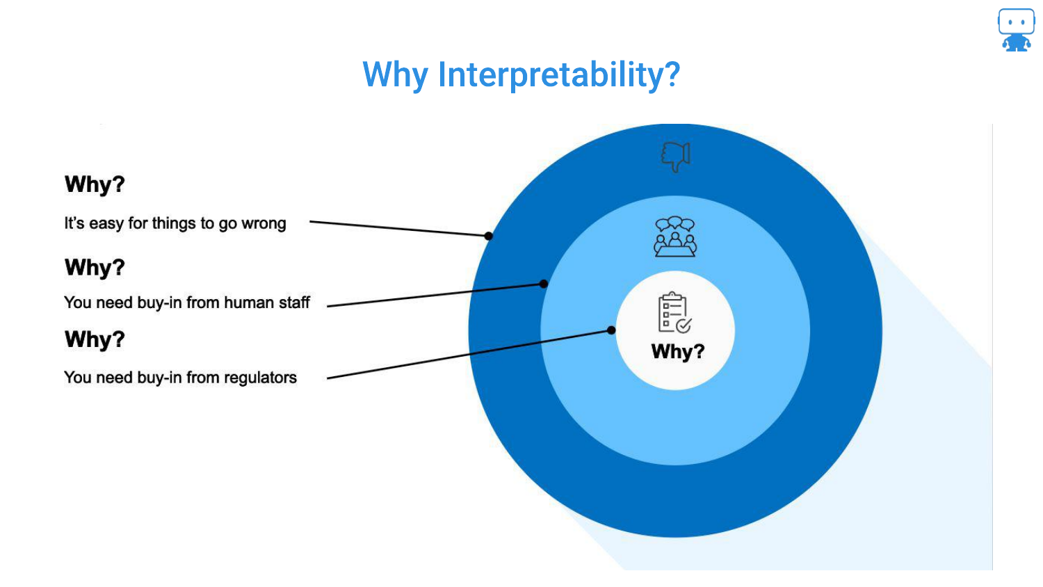
This slide outlines the three key audiences for interpretability. First, for Yourself: debugging is essential because “it’s very easy for things to go wrong.” Second, for Stakeholders: managers and bosses will demand to know how a model works, regardless of how high the AUC (Area Under the Curve) is.
Third, the speaker highlights Regulators in high-risk industries like insurance, finance, and healthcare. In these sectors, there is a “higher standard set” where you must prove you understand the model’s behavior to mitigate risks to the financial system or public health.
6. An Understandable White Box Model (CLEAR-2)
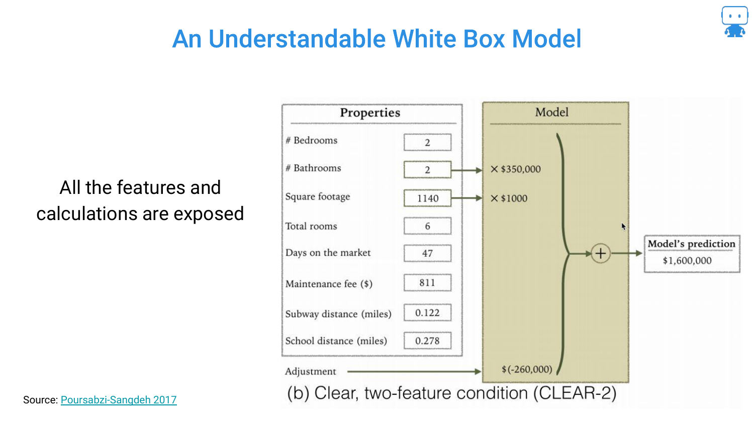
The presentation begins with the “simplest, easiest, most interpretable model”: a linear regression for housing prices. This White Box Model uses only two features: the number of bathrooms and square footage.
The transparency is total; you can see the coefficients directly (e.g., multiplying bathrooms by a value). The audience is asked to confirm that this is intuitive, and the consensus is that yes, this is an easily explainable model where the inputs have a clear, logical relationship to the output.
7. White Box Model (CLEAR-8)
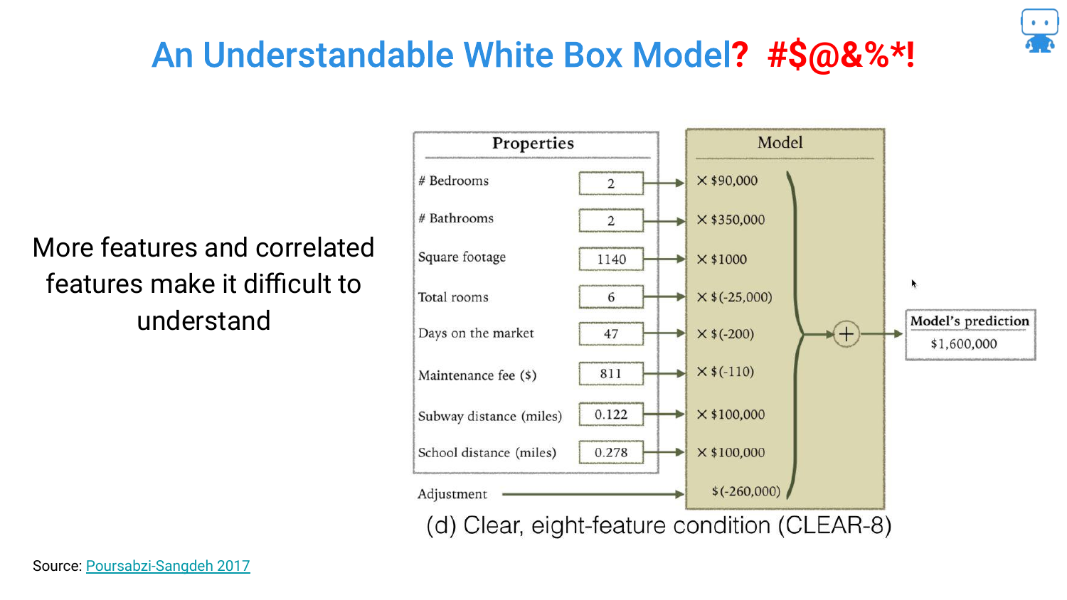
Complexity is introduced by adding more features to improve accuracy. However, this slide reveals a paradox of linear models: Multicollinearity. The speaker points out that while the model might be “transparent” (you can see the math), the logic breaks down.
Specifically, the model shows that “as the total rooms gets higher, the value of my house goes down.” This counter-intuitive finding occurs because features are not independent. While technically a “white box,” the interpretability suffers because the coefficients no longer align with human intuition due to correlations between variables.
8. Understandable White Box Model? (Tree - AUC 0.74)
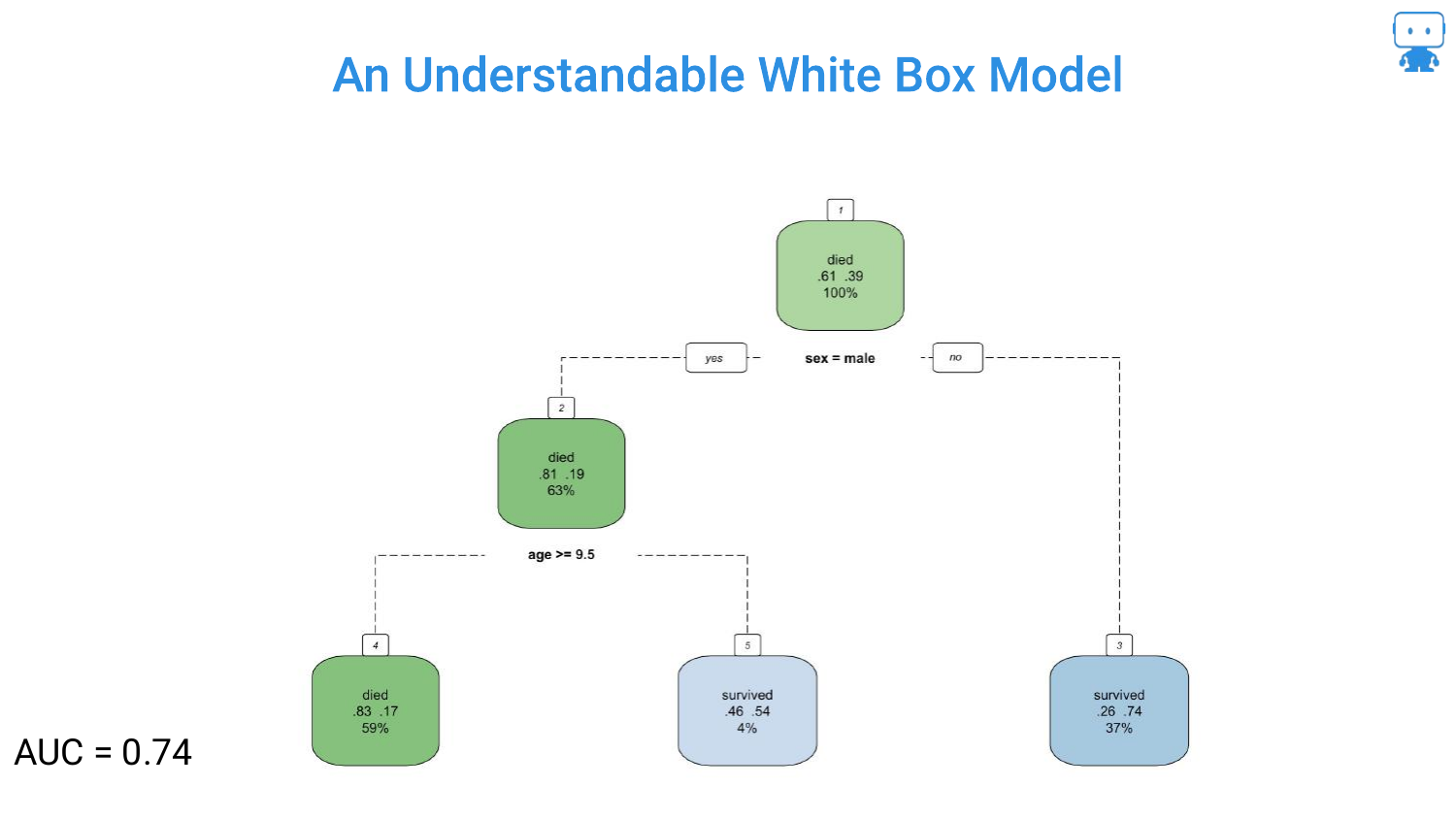
Moving to Decision Trees, the speaker presents a simple tree based on the Titanic dataset (predicting survival). With only two features (gender and age), the logic is stark and easy to follow: “if you’re a male and your age is greater than 10 years old… chance of survival is very low.”
This model has an AUC of 0.74. It is highly interpretable, acting as a flowchart that anyone can trace. However, the speaker hints at the limitation: simplicity often comes at the cost of accuracy.
9. Understandable White Box Model? (Tree - AUC 0.78)
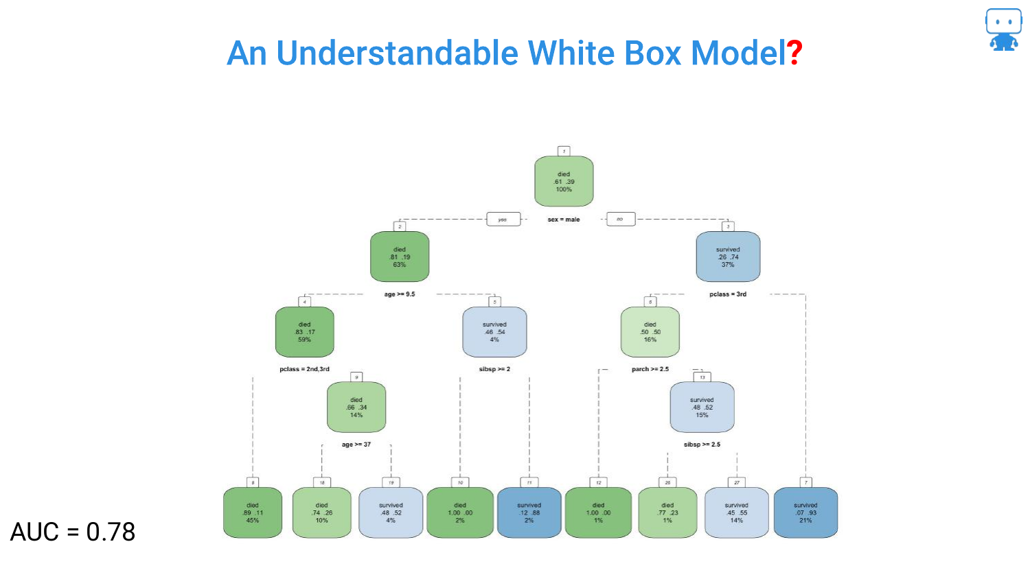
To improve the model, more features are added, raising the AUC to 0.78. The tree grows branches, becoming visually more cluttered. The speaker notes that “by adding more features or variables… the performance of our model increases.”
This slide represents the tipping point where the visual representation of the model starts to become less of a helpful flowchart and more of a complex web, though it is still technically possible to trace a single path.
10. Understandable White Box Model? (Tree - AUC 0.79)
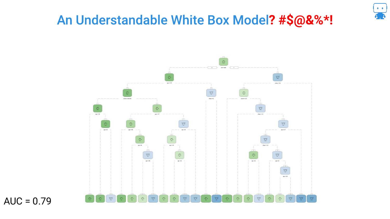
The optimization continues, pushing the AUC to 0.79. The tree on the slide is now dense and difficult to read. The question mark in the title “Understandable White Box Model?” becomes more relevant.
The speaker emphasizes that data scientists “don’t have to kind of stop there.” The drive for higher accuracy encourages adding more depth and complexity to the tree, sacrificing the immediate “glance-value” interpretability that smaller trees possess.
11. Better Performance but too much to Comprehend (AUC 0.81)
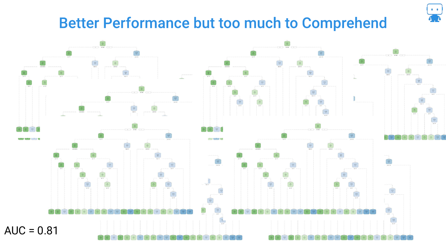
This slide shows a massive, unreadable decision tree with an AUC of 0.81. The speaker notes, “it gets a little tricky… lot harder to understand what’s going on.” This illustrates the “Black Box” problem even within models considered interpretable.
Furthermore, the speaker points out that data scientists rarely stop at one tree; they use Random Forests (collections of trees). Interpreting a forest by looking at the trees is impossible, necessitating new tools for explanation.
12. So Many Algorithms to Try
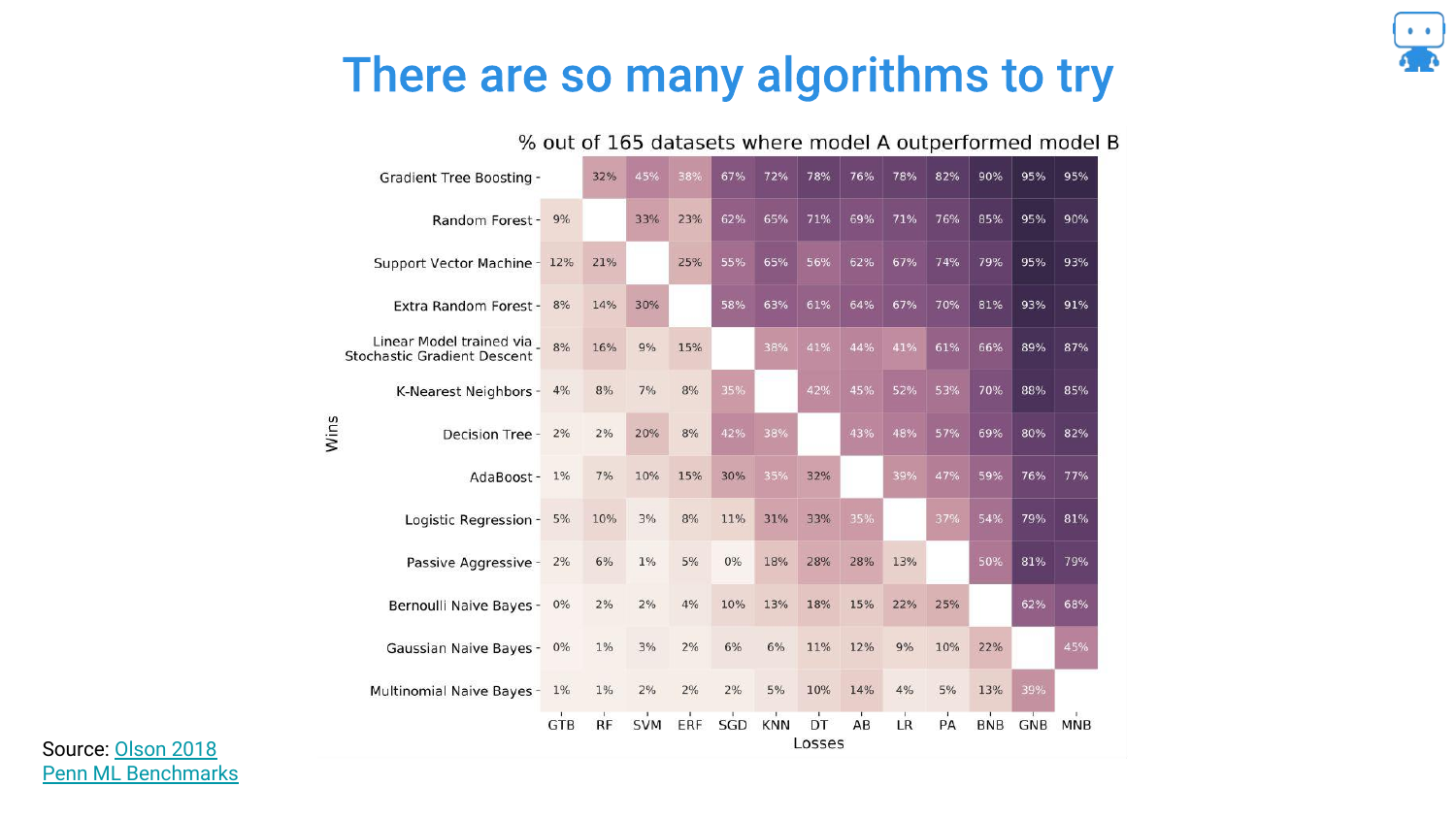
This heatmap, derived from a study by Randy Olssen, visualizes the performance of different algorithms across 165 datasets. It illustrates the No Free Lunch Theorem: there is not one single algorithm that always works best.
Because of this, data scientists must try various complex algorithms (Gradient Boosting, Neural Networks, Ensembles) to find the best solution. We cannot simply restrict ourselves to linear regression just for the sake of interpretability if it fails to solve the problem.
13. Algorithms Matter
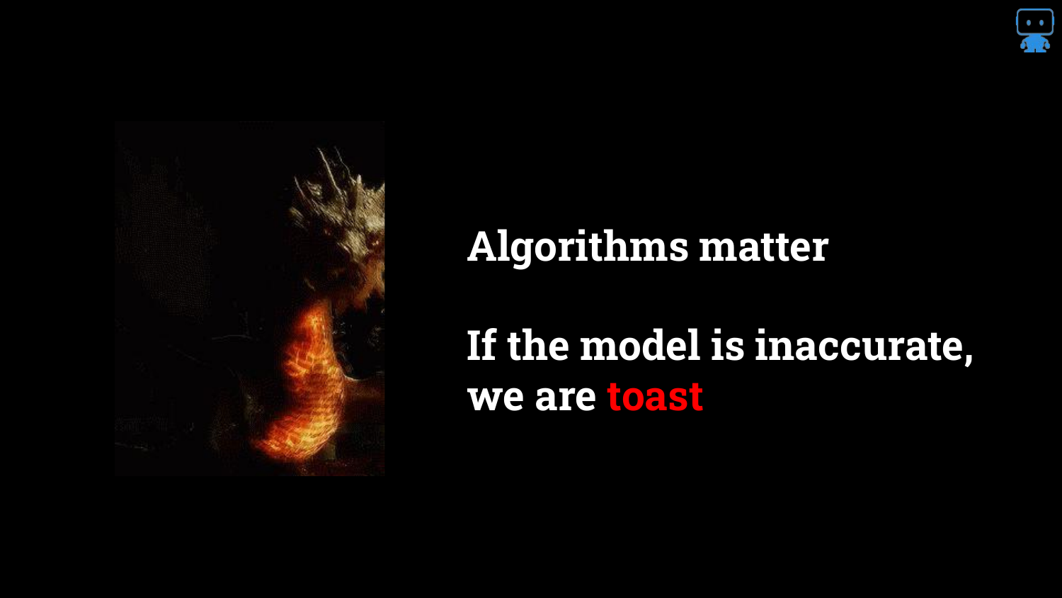
The speaker reinforces that model choice is critical. Using a simple model that yields inaccurate predictions is dangerous: “if we can’t figure out if this model is going to work or not we’re in trouble.”
The slide emphasizes that accuracy is paramount (“we are toast” if we are wrong). Therefore, we need methods that allow us to use complex, accurate algorithms without flying blind regarding how they work.
14. Simple Models != Accurate
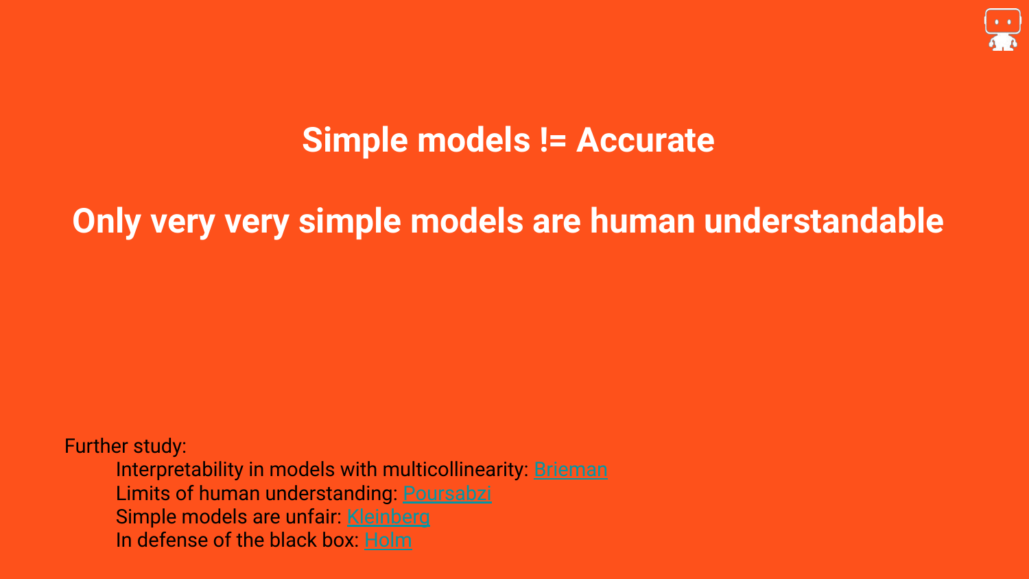
This slide counters the argument that we should only use simple models. The speaker asserts, “most simple models are just not very accurate.” Real-world problems are complex, and if they could be solved with a few simple rules, machine learning wouldn’t be necessary.
Resources are provided on the slide for further reading, including defenses of black box models. The takeaway is that complexity is often a requirement for accuracy, so we must find ways to explain complex models rather than avoiding them.
15. Tools That Can Explain Any Black Box Model

This is the pivot point of the presentation. The speaker introduces the solution: “There are tools here that can explain any blackbox model.” This promises a methodology that is Model Agnostic—meaning it works regardless of whether you are using a Random Forest, a Neural Network, or an SVM.
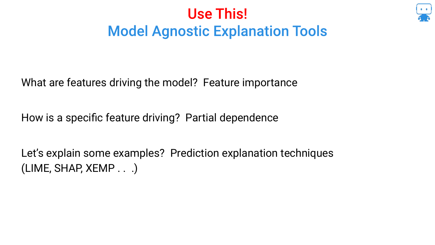
16. Model Agnostic Explanation Tools
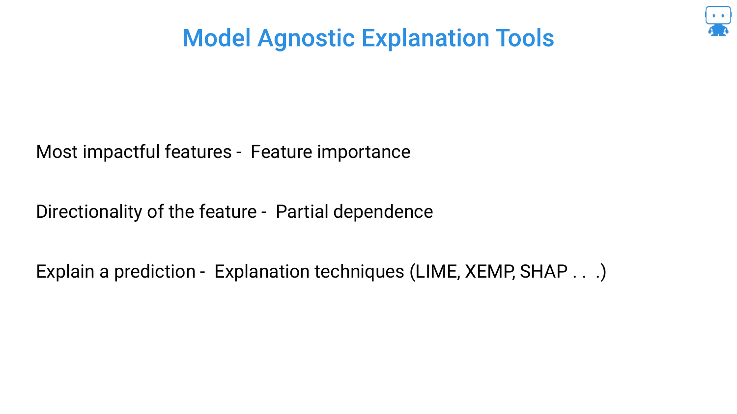
The speaker outlines the three specific pillars of interpretability that the rest of the talk will cover: 1. Feature Importance: Understanding what variables are most impactful. 2. Partial Dependence: Understanding the directionality of features (e.g., does age increase or decrease risk?). 3. Prediction Explanations: Explaining why a specific prediction was made for a specific individual (using techniques like SHAP).
17. Feature Importance

The first pillar is Feature Importance. Returning to the dragon example, the speaker discusses the data collection process: asking domain experts (or watching Game of Thrones) to determine factors like age, weight, or number of children.
The goal is to determine which of these collected variables actually drives the model. This is crucial for debugging, feature selection, and explaining the model to stakeholders.
18. Dragon Reading: Milk vs. Age

To illustrate the pitfalls of feature importance, the speaker introduces a new scenario: “how dragons learn to read.” We intuitively know that Age affects reading ability (older children read better).
The speaker then asks about Milk Consumption. While one might guess milk helps (calcium), the reality is that milk consumption is negatively correlated with age (babies drink milk, teenagers don’t). Therefore, milk consumption appears related to reading ability, but it is a spurious correlation. It has “nothing at all to do with the ability to read,” yet the data might suggest otherwise.
19. Split Based Variable Importance
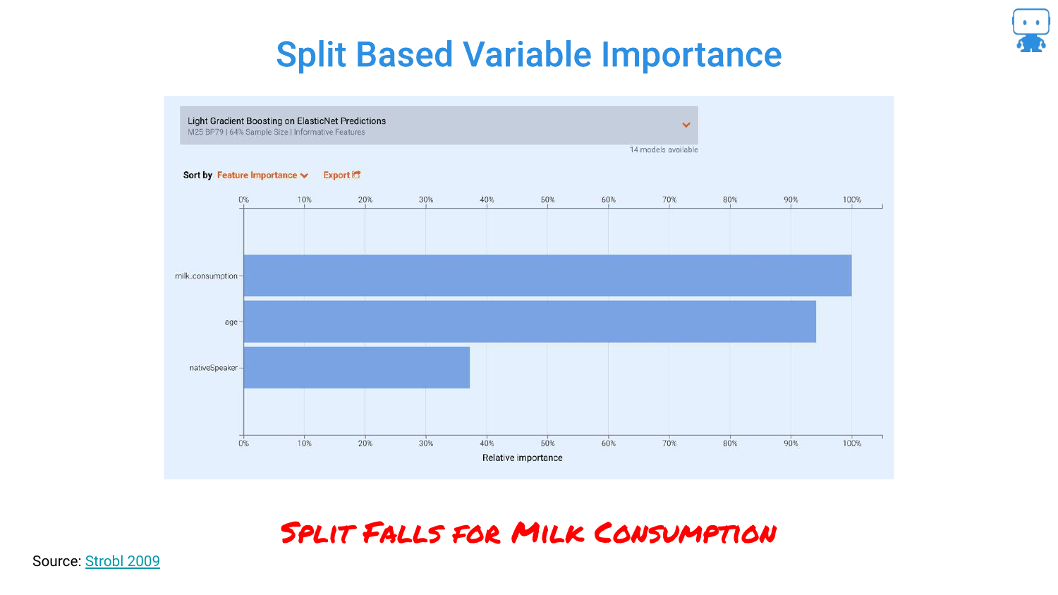
This slide shows what happens when you use the default “Split Based” importance metric in algorithms like LightGBM. The chart shows milk_consumption as the most important feature, ranking higher than age.
This happens because the model uses milk consumption as a proxy for age during the tree-splitting process. The speaker warns that relying on default metrics can lead to incorrect conclusions where spurious correlations mask the true drivers of the model.
20. Permutation Based Variable Importance
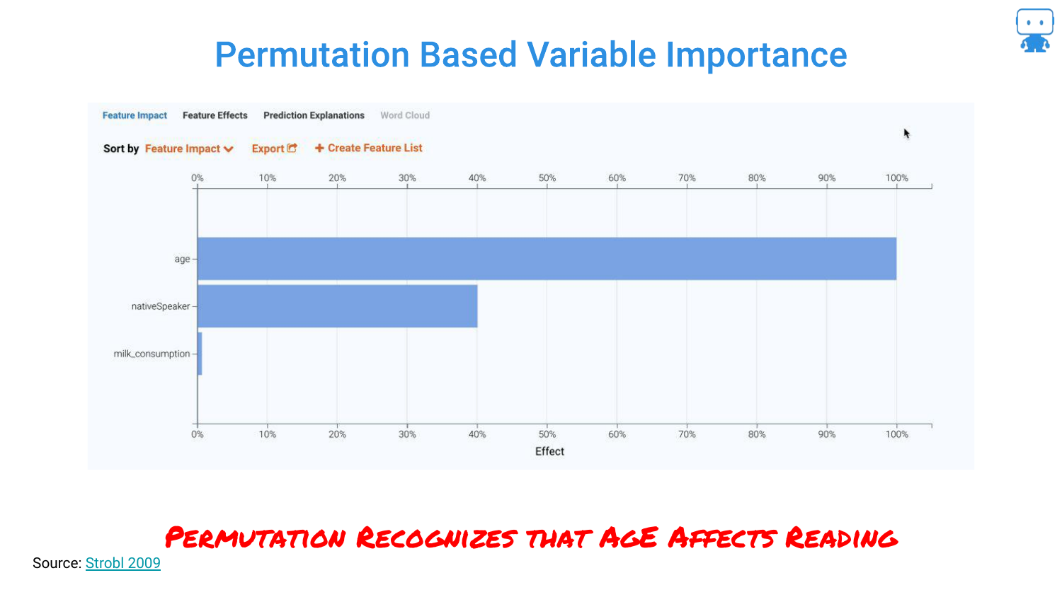
By switching to a Permutation Based approach, the chart flips. Now, Age is correctly identified as the dominant feature, and milk consumption drops to near zero importance.
The speaker emphasizes that this technique “cuts right through” the noise. It correctly identifies that while milk varies with age, it does not actually influence the reading score when age is accounted for.
21. Spurious Correlations (Nicolas Cage)
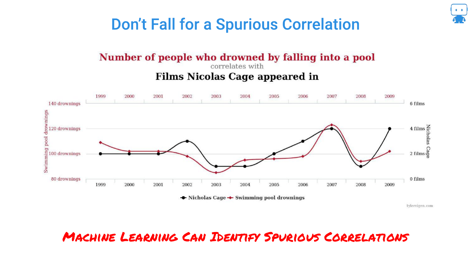
This slide references the famous spurious correlation between Nicolas Cage films and swimming pool drownings. The speaker uses this to highlight the danger of “Enterprise Data Lakes.”
When data scientists grab massive tables of data without domain knowledge, they risk finding these coincidental patterns. Machine learning models are excellent at finding patterns, even ones that are nonsensical, making robust feature importance techniques vital.
22. Feature Impact Ranking

The presentation shows a ranked list of features for the dragon model. The speaker reiterates that getting this ranking right has “real consequences.”
If you tell a business stakeholder that a specific variable is driving the risk, they will make decisions based on that. Understanding the true hierarchy of influence is essential for trust and actionable insight.
23. If Your Feature Impact is Wrong…

A humorous but serious warning: “If your feature impact is wrong, you are toast.”
This underscores the professional risk. If a data scientist attributes a prediction to the wrong cause (like milk instead of age), they lose credibility and potentially cause the business to pull the wrong levers to try and optimize the outcome.
24. Feature Importance: Ablation Methodology
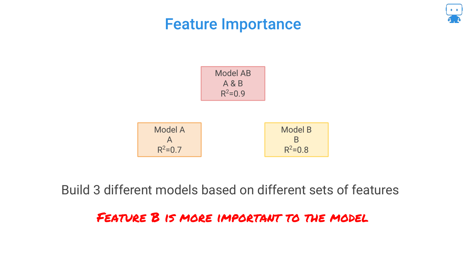
The speaker explains the logic behind feature importance using an Ablation Methodology. He presents three models: 1. Model AB (Both features): R-squared 0.9 2. Model A (Feature A only): R-squared 0.7 3. Model B (Feature B only): R-squared 0.8
He asks the audience to intuit which feature is more important based on these scores.
25. Ablation Methodology Definition

The audience correctly identifies that Feature B is more important because it carries more signal (higher R-squared) on its own.
The speaker defines Ablation as comparing the model performance with and without specific features. It is a scientific control method: “try something with it and without it,” similar to testing if coffee makes a person happy by withholding it for a day.
26. ‘Leave it Out’ Feature Importance
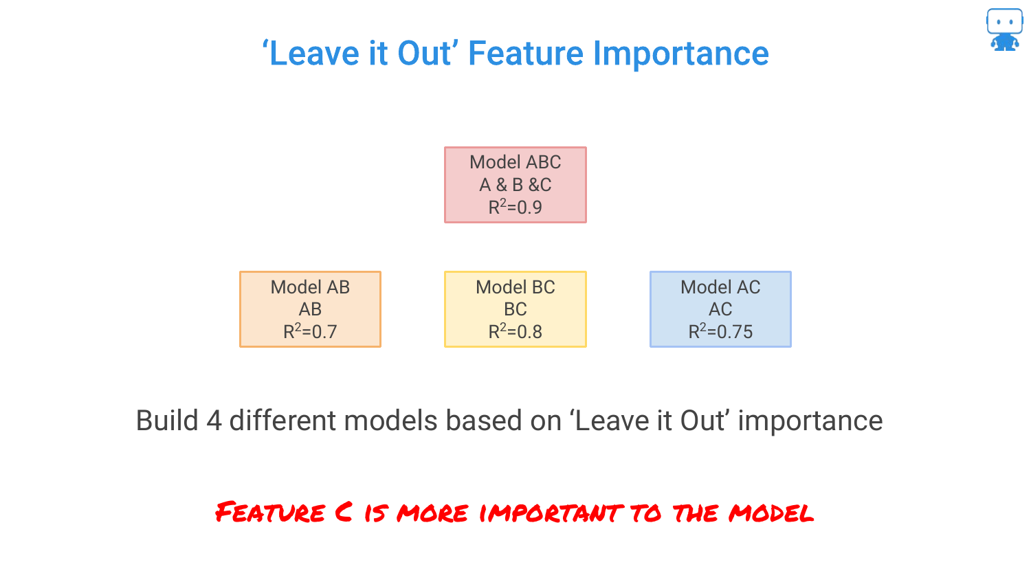
This slide formalizes the “Leave One Out” approach. By calculating the drop in performance when a feature is removed, we quantify its value. * Remove B: Performance drops by 0.2 (0.9 -> 0.7). * Remove A: Performance drops by 0.1 (0.9 -> 0.8).
Since removing B causes a larger drop in accuracy, B is the more important feature. However, the speaker notes a problem: with 100 features, you would have to build 100 different models, which is computationally expensive.
27. Permutation Based Feature Importance
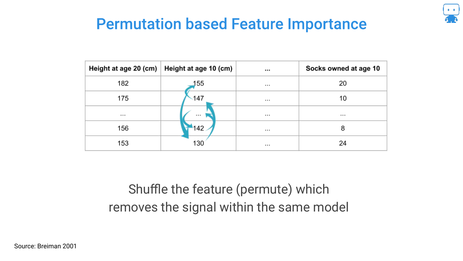
To solve the computational cost of retraining models, the speaker introduces Permutation Importance (attributed to Breiman/Random Forests). Instead of removing a column and retraining, you simply shuffle the values of that column (permute them) within the existing test data.
By shuffling the data, you break the relationship between that feature and the target, effectively “removing” the signal while keeping the model structure intact. If the model’s error increases significantly after shuffling a feature, that feature was important.
28. R Package: randomForest
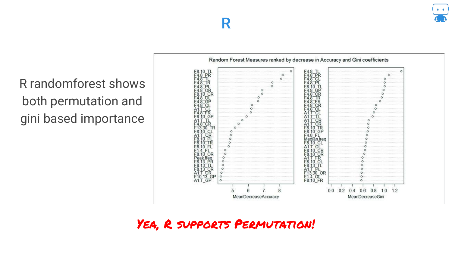
The speaker highlights that this is a standard technique available in common tools. In the R language, the randomForest package has supported permutation-based importance for a long time.
This slide serves as a resource pointer for R users, confirming that these advanced interpretability checks are accessible within their standard toolkits.
29. Python: scikit-learn
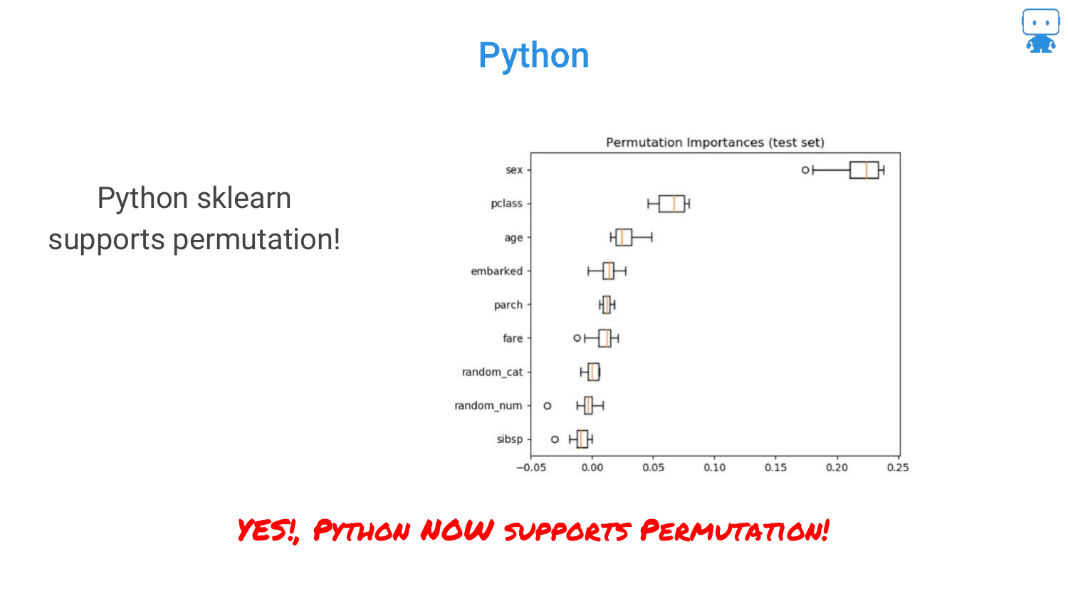
Similarly, for Python users, scikit-learn has added support for permutation importance. This accessibility reinforces the speaker’s point that there is no excuse for not using these techniques to validate model behavior.
30. Multicollinearity
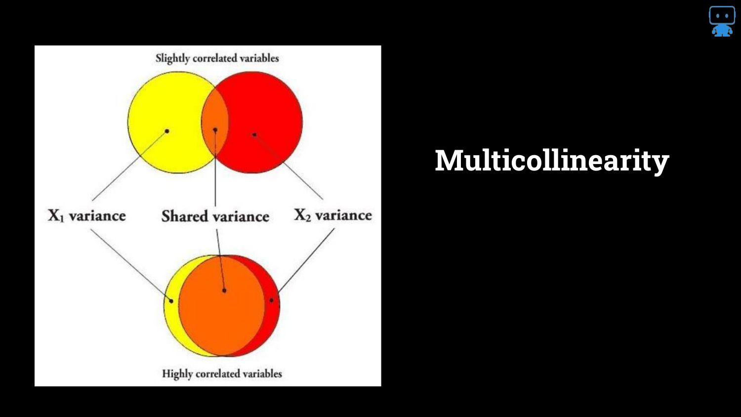
The speaker addresses a complex issue: Multicollinearity. The Venn diagrams illustrate that features often share information (variance).
When features are highly correlated, they “share the signal.” This makes it difficult for the model (and the interpreter) to assign credit. Does the credit go to Feature A or Feature B if they both describe the same underlying phenomenon?
31. 10 Different Models, 10 Different Importances
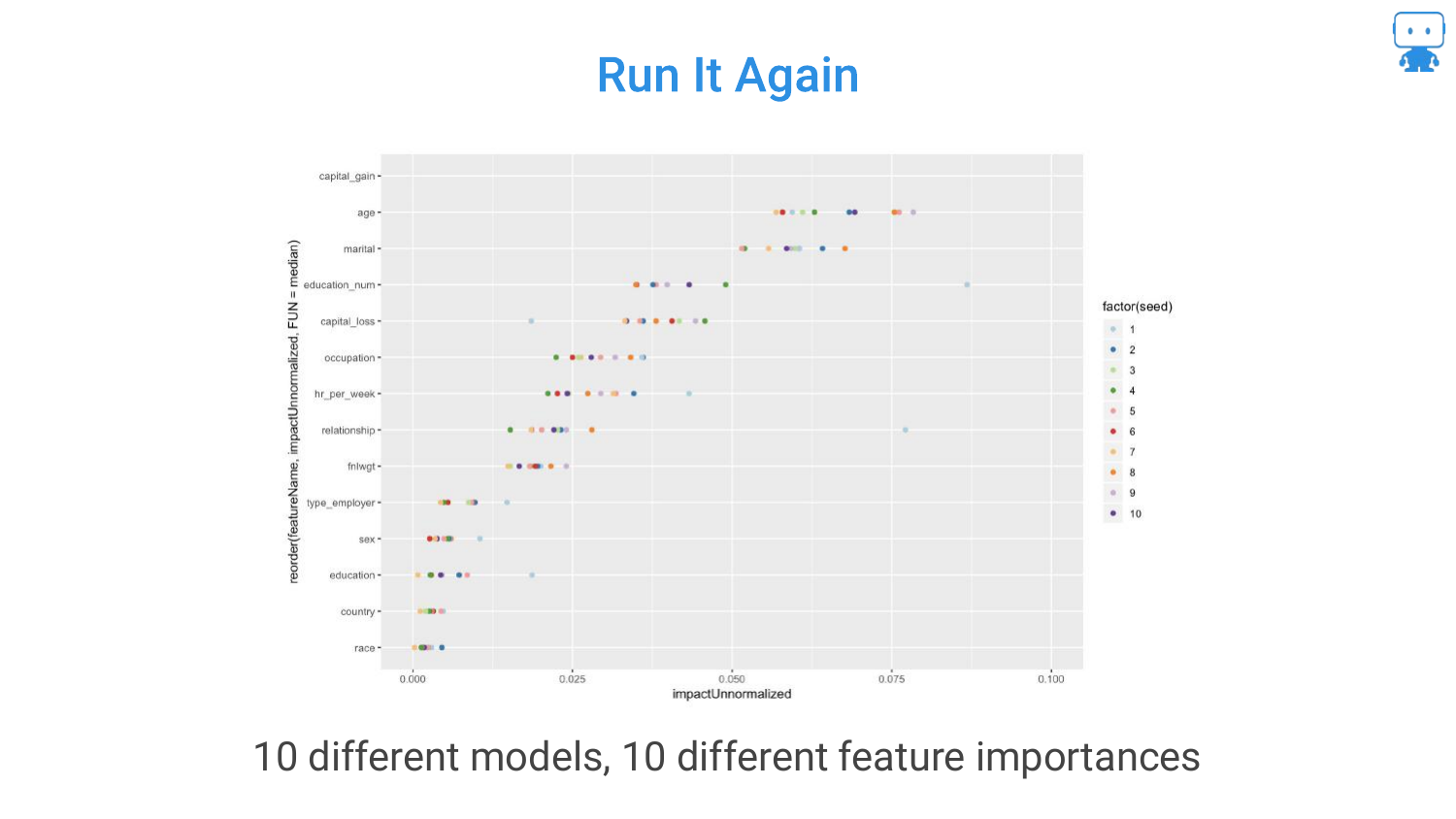
Due to multicollinearity, running the same algorithm on the same data multiple times (with different random seeds or data partitions) can result in different feature rankings.
This instability is frustrating. In one run, “Milk” might be important; in another, “Age” takes the lead. This happens because the model arbitrarily chooses one of the correlated features to split on, and this choice changes based on randomness in the training process.
32. Multicollinearity Affects Interpreting Models
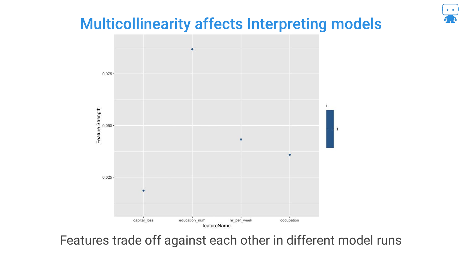
This chart visualizes the “trading off” effect. You can see features swapping positions in importance rankings across different model runs.
The speaker notes that you cannot simply remove correlated features without potentially hurting accuracy, as they might contain slight unique signals. This trade-off between accuracy and stable interpretability is a core challenge in data science.
33. Pro Tip: Aggregate Feature Importance (Same Model)
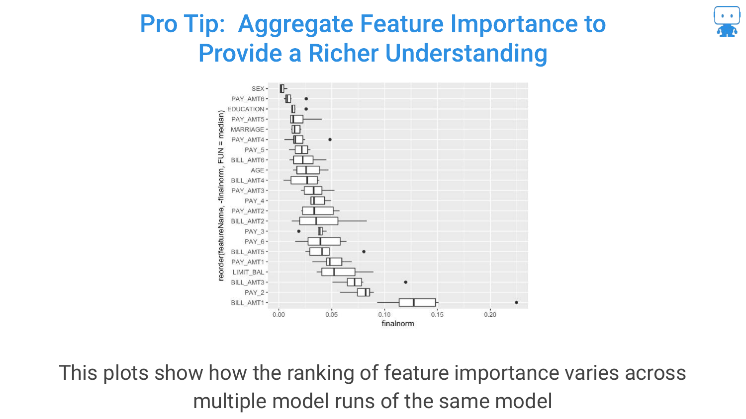
To handle instability, the speaker suggests a “Pro Tip”: Aggregate Feature Importance. Run the feature importance calculation multiple times on the same model and plot the variability (the box plots in the slide).
This gives a “richer understanding.” Instead of a single number, you see a range. If the range is huge, you know the feature’s importance is unstable due to correlation or noise.
34. Aggregate Feature Importance (Different Models)
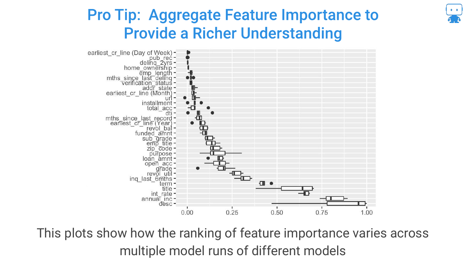
Expanding on the previous tip, you can also aggregate importance across different models (e.g., comparing importance in a Random Forest vs. a Gradient Boosted Machine).
If a feature is consistently important across different algorithms and multiple runs, you can be much more confident that it is a true driver of the target variable.
35. Pro Tips: Add Random Features
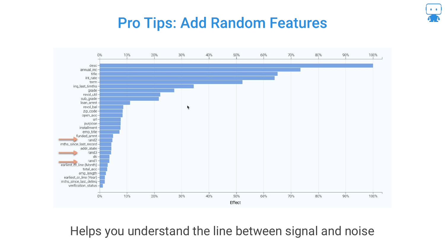
Another technique mentioned is adding a Random Feature (noise) to the dataset. If a real feature ranks lower in importance than the random noise variable, it is likely not a significant predictor.
This serves as a baseline or “sanity check” to distinguish true signal from statistical noise in the feature ranking list.
36. Permutation Based Importance Conclusion
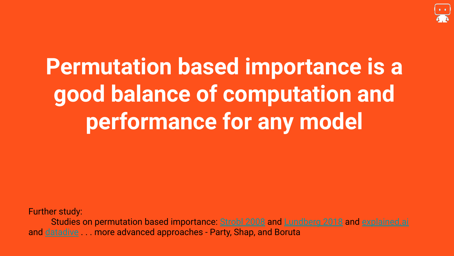
The section concludes by asserting that Permutation based importance is the “best practice.” It offers a “good balance of computation and performance for any model.”
References to academic papers (like Strobl) are provided for those who want to dive into the edge cases, but for general application, this is the recommended approach for determining what matters in a model.
37. Partial Dependence

The second tool introduced is Partial Dependence. While feature importance tells us which variables matter, Partial Dependence tells us how they matter.
The slide shows example plots for Age and Weight. The goal is to understand the functional relationship: as age increases, does the predicted aggression go up, down, or follow a complex curve?
38. Effect of Age on Our Target
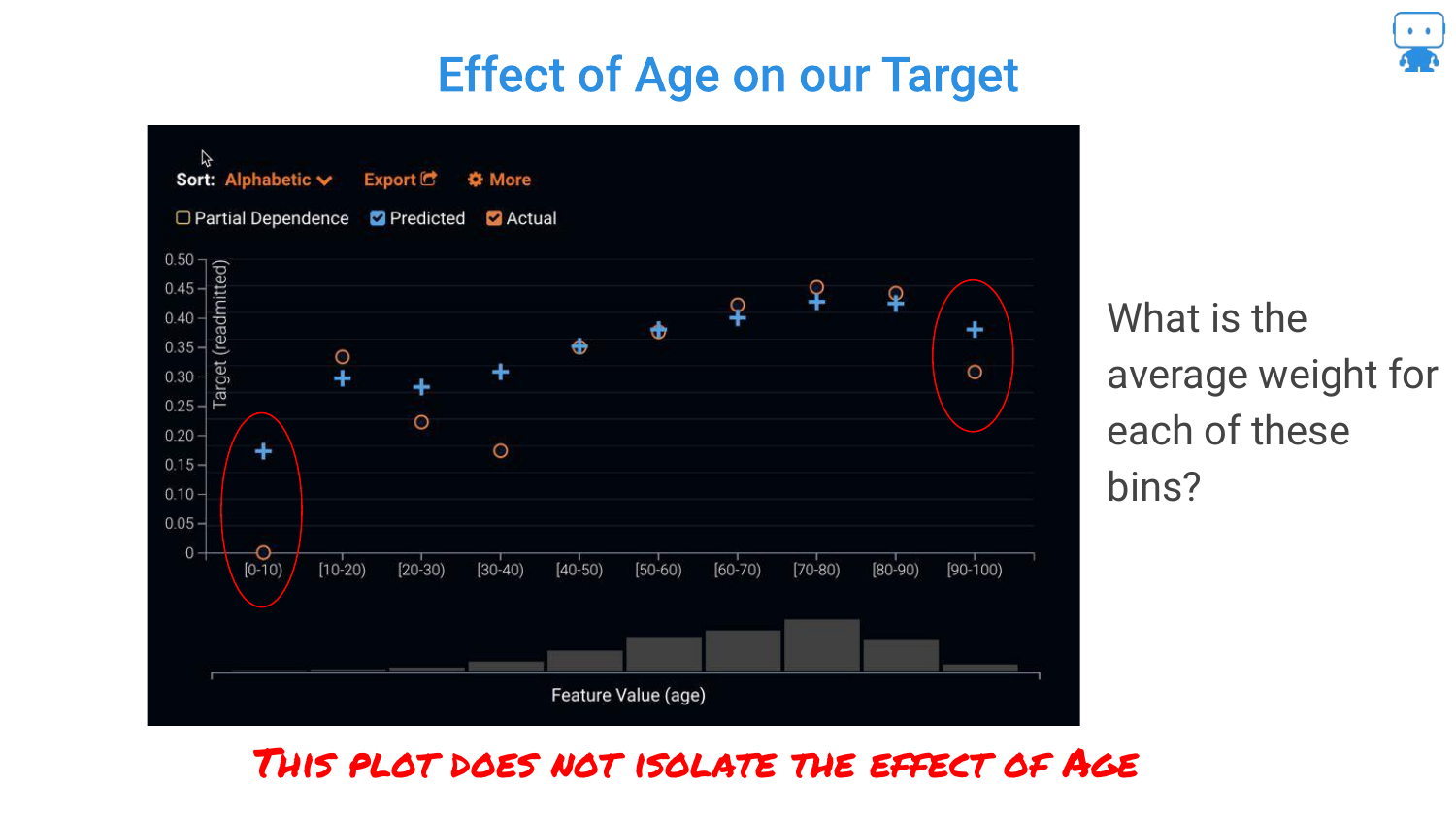
The speaker reiterates that in complex “black box” models, we don’t have coefficients (positive or negative signs) like in linear regression. We cannot simply say “age is positive.”
Therefore, we need a visualization that maps the input value to the prediction output to understand the behavior of the model across the range of the feature.
39. Calculating Partial Dependence (Step 1)
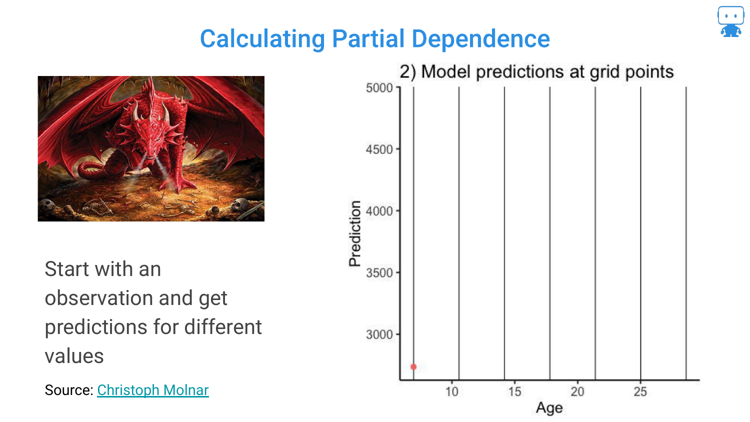
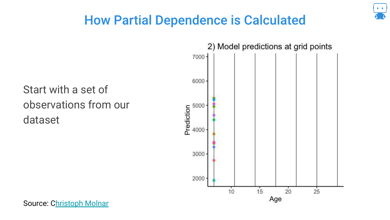
To explain how Partial Dependence is calculated, the speaker walks through the process. Step 1: Take a single observation (one Dragon).
Step 2: Keep all features constant except the one we are interested in (Age). Manually force the age to different values (e.g., 5, 10, 15 years old) and ask the model for a prediction at each point. This generates a hypothetical curve for that specific dragon.
40. Calculating Partial Dependence (Step 2)
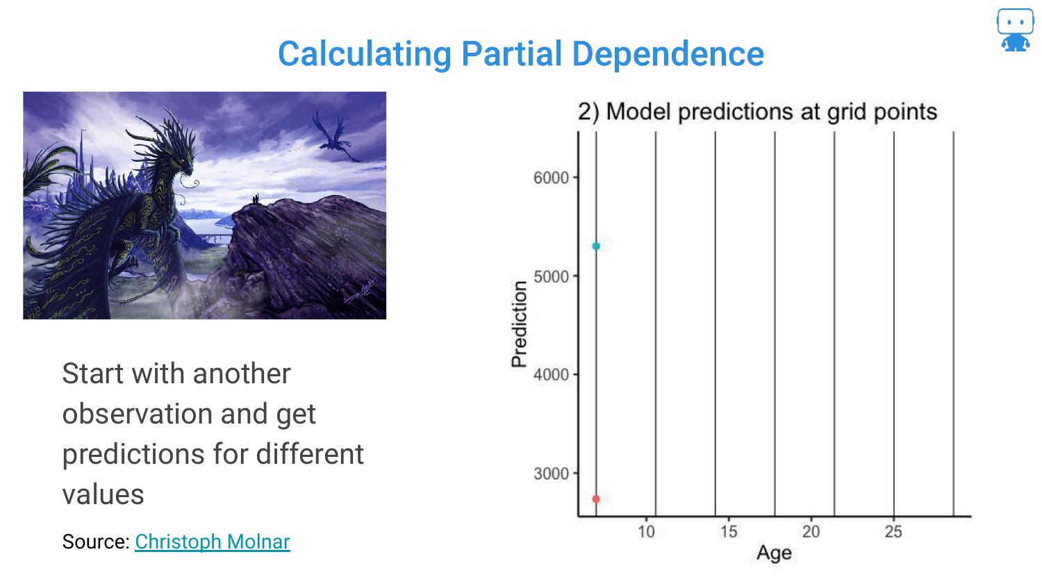
The process is repeated for a second dragon. Because the other features (weight, color, etc.) are different for this dragon, the curve might look slightly different (higher or lower baseline), but it follows the model’s logic for age.
41. Calculating Partial Dependence (Step 3)
This is repeated for many observations in the dataset. The slide shows multiple data points being generated. This creates a “what-if” scenario for every dragon in the dataset across the spectrum of ages.
42. Individual Conditional Expectation (ICE) Curves
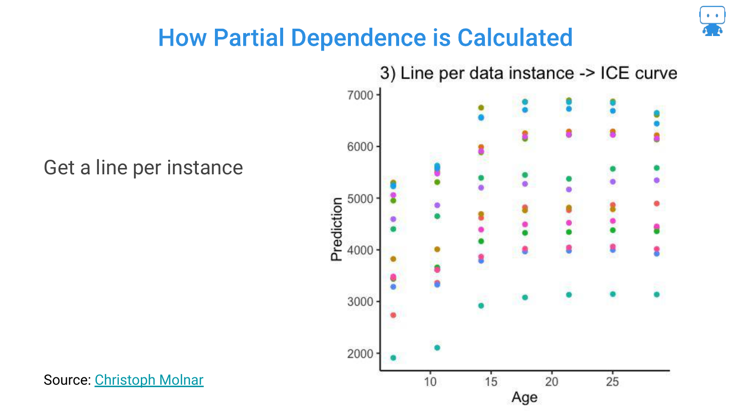
When you draw lines connecting these predictions for each individual instance, you get ICE Curves (Individual Conditional Expectation).
This visualizes the relationship between the feature and the prediction for every single data point. It shows the variability: for some dragons, age might have a steep effect; for others, it might be flatter.
43. Partial Dependence Plots (PDPs)
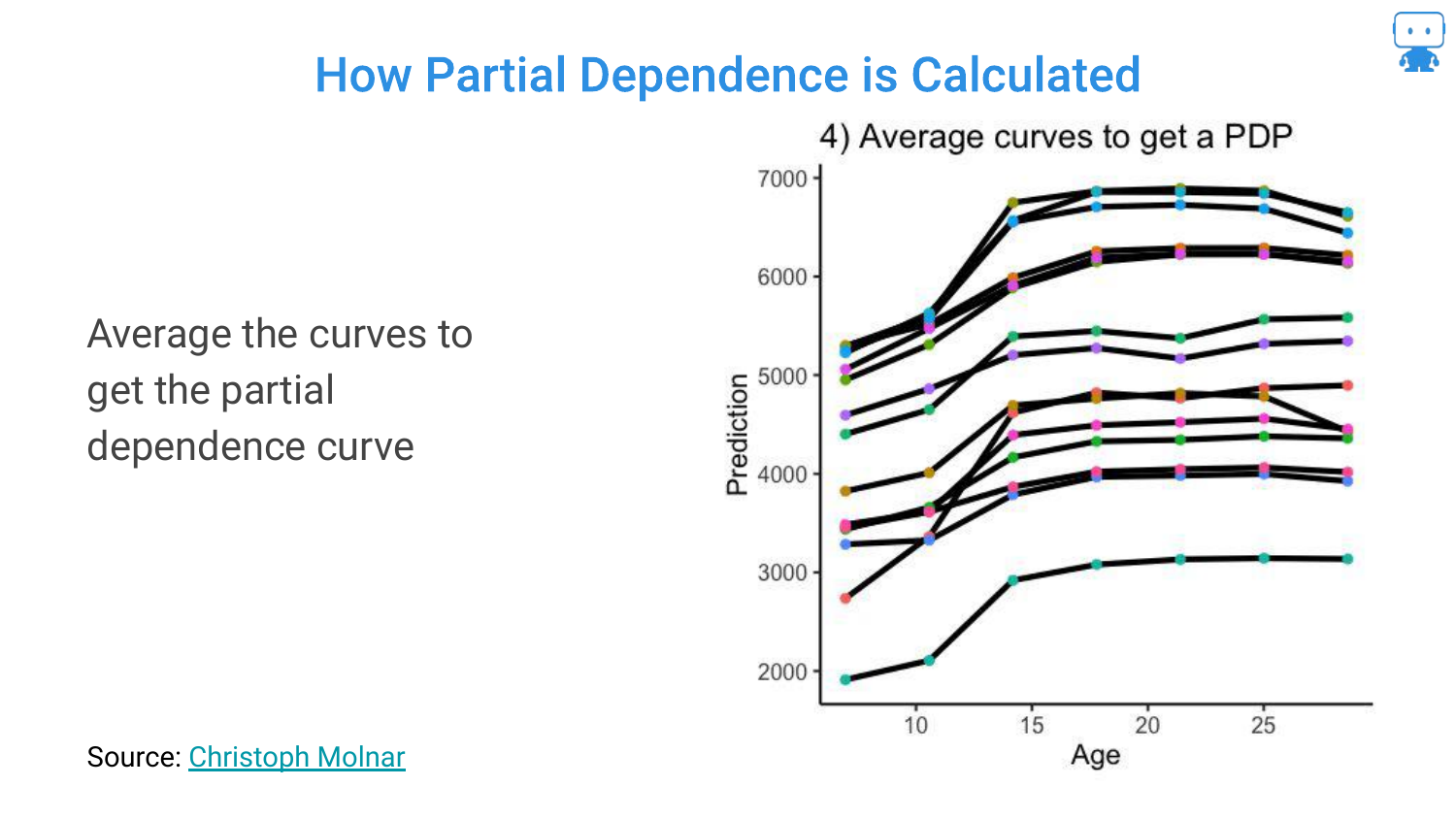
To get the Partial Dependence Plot (PDP), you simply average all the ICE curves.
This single line represents the average effect of the feature on the model’s prediction, holding everything else constant. It distills the complex interactions into a single, interpretable trend line.
44. Resulting Partial Dependence
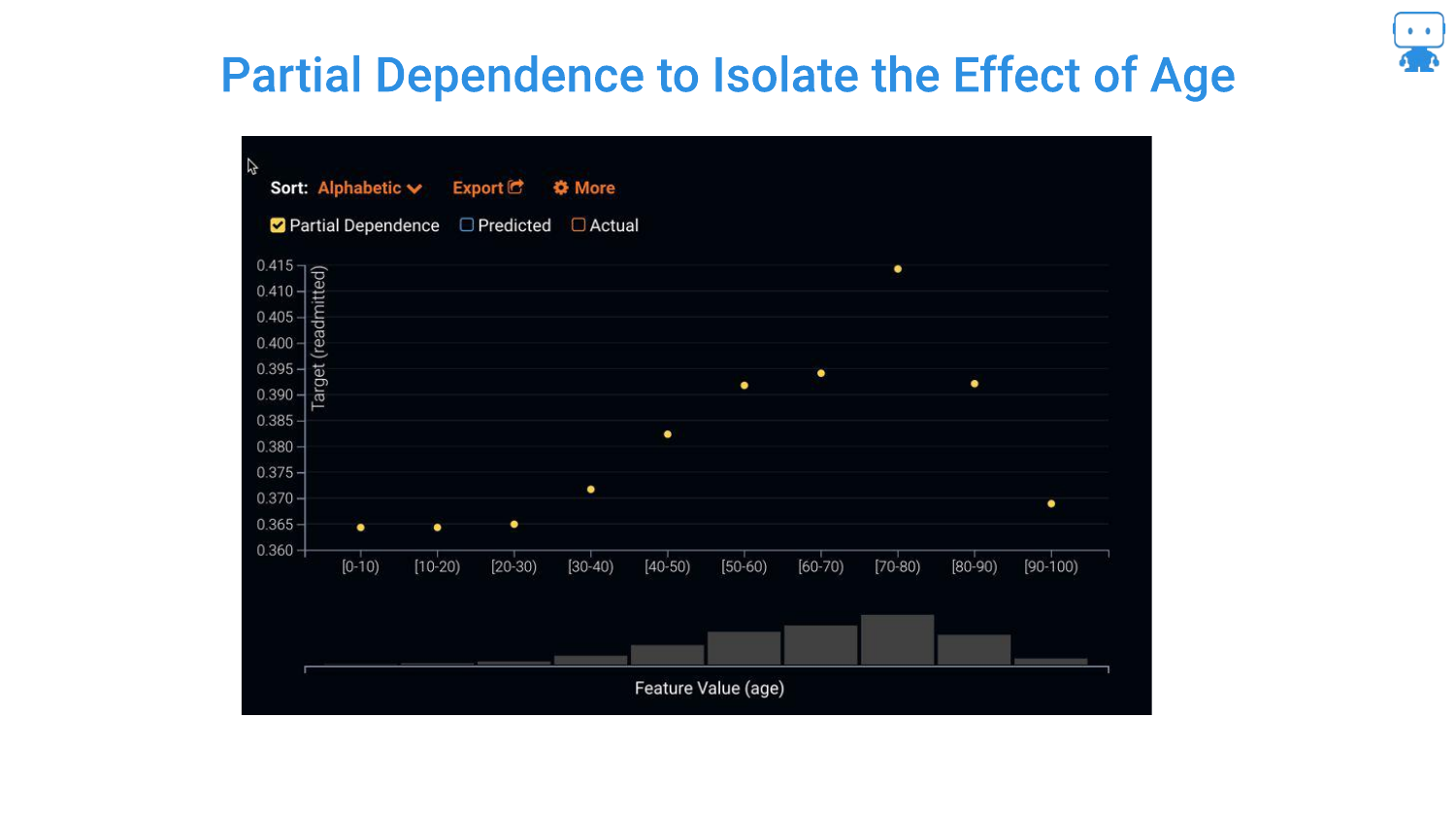
The final plot shows the isolated effect of Age. The speaker notes this gives “really good insight.” We can now see if the risk rises linearly with age, or if (as often happens in nonlinear models) it plateaus or dips at certain points.
45. ICE Plots
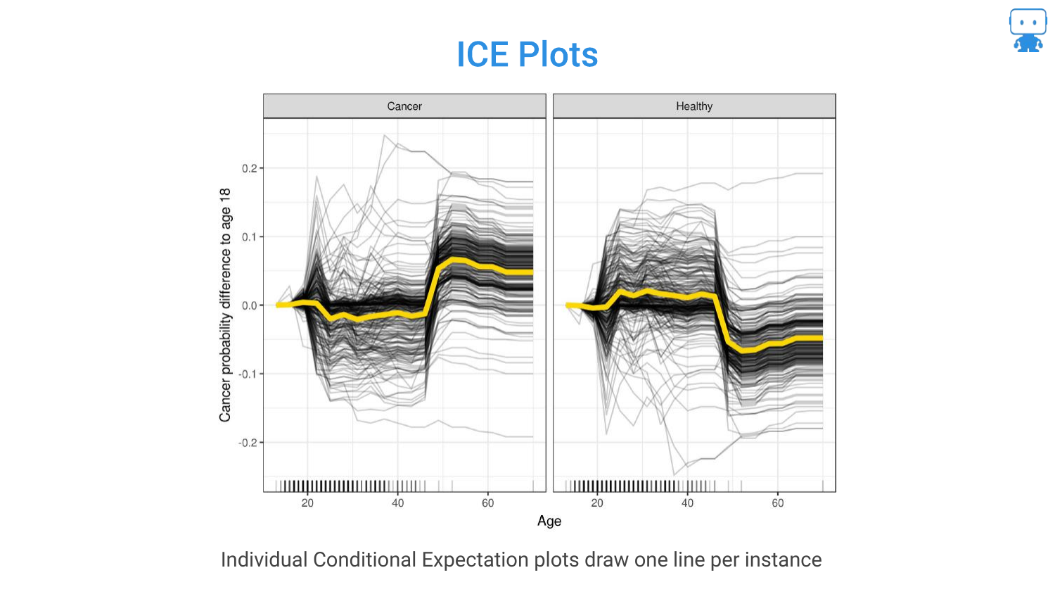
This slide formally defines ICE Plots. While the PDP shows the average, ICE plots are useful for seeing heterogeneity. For example, if the model treats males and females differently, the ICE curves might show two distinct clusters of lines that the average PDP would obscure.
46. Partial Dependence to Show Price Elasticity
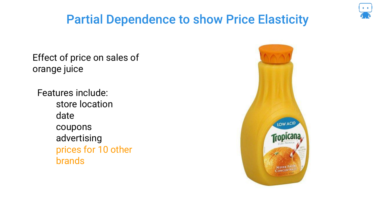
The speaker moves to a real-world example: Orange Juice Sales. The goal is to understand Price Elasticity—if we raise the price, do sales go down?
Economics 101 says yes, but the model includes complex factors like store location, coupons, and competitor prices (10 other brands), making it a high-dimensional problem.
47. Change in Price Affects Sales?
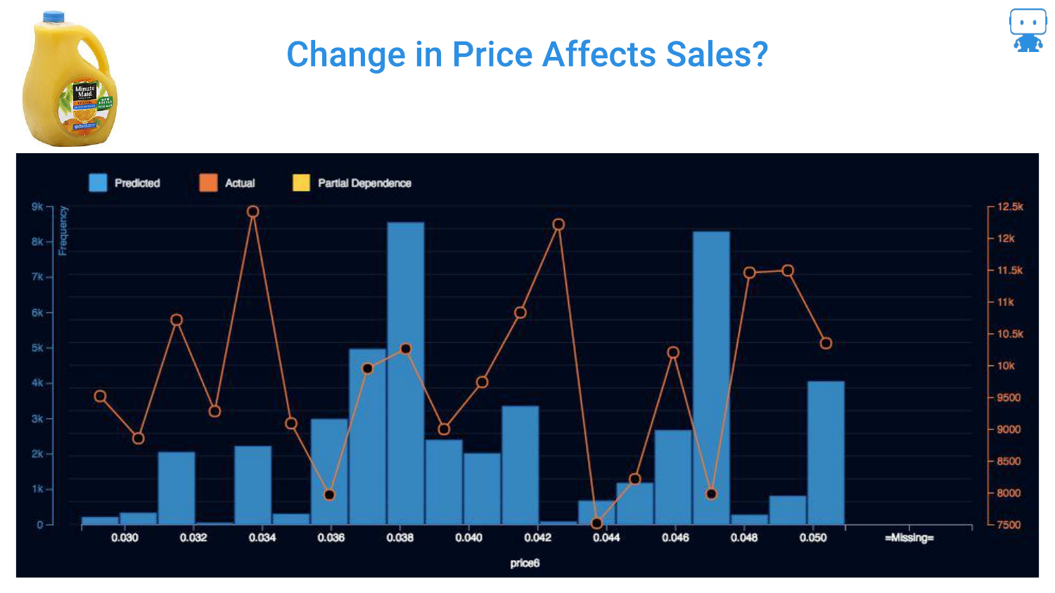
This chart shows the raw data (orange line) of Price vs. Sales. It is “all over the place.” There is no clear linear relationship visible because the data is noisy and confounded by other variables (e.g., maybe high prices occurred during a holiday when sales were high anyway).
Looking just at the raw data fails to isolate the specific impact of the price change on consumer behavior.
48. Ahh, Price Does Affect Sales!
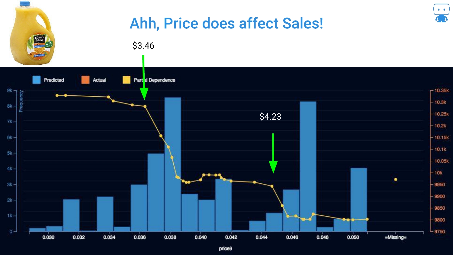
By applying Partial Dependence, the signal emerges from the noise. The blue line clearly shows that as price increases, sales generally decrease.
Crucially, the plot reveals a non-linear drop at exactly $3.50. The speaker interprets this as a psychological threshold where customers decide “maybe I’ll buy something else.” This insight—a specific price point where demand collapses—is only visible through this interpretability technique.
49. Distributions and Partial Dependence
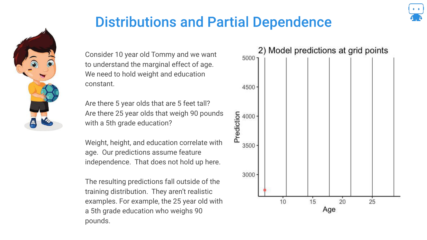
A warning is issued regarding Distributions. Partial Dependence assumes you can vary a feature independently of others. However, if features are correlated, you might create impossible combinations (like a 5-year-old dragon that weighs 5 tons).
Making predictions on these “impossible” data points means extrapolating outside the training distribution, which can lead to unreliable explanations.
50. Partial Dependence Conclusion
The speaker concludes that Partial Dependence is a “best practice” for understanding feature behavior. References to Goldstein and Friedman (classic papers) are provided.
This tool answers the “directionality” question, proving that the model aligns with domain knowledge (e.g., higher prices = lower sales).
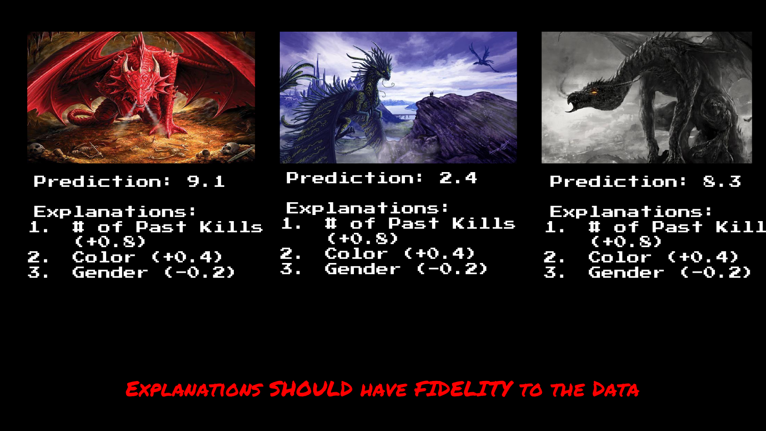
51. Predictions
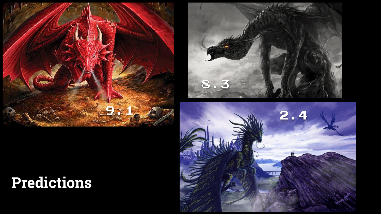
The final section focuses on Predictions. The speaker shows three dragons with their associated risk scores (9.1, 2.4, etc.).
While the model successfully identifies the red dragon as high risk, the next logical question from a user is “Why?”
52. Predictions & Explanations
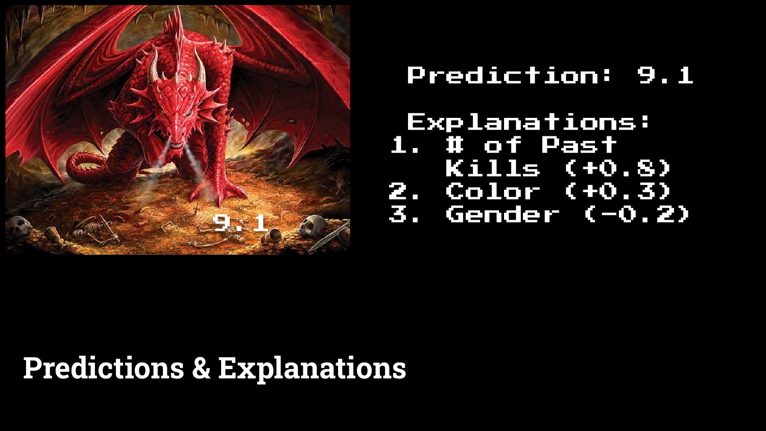
This slide introduces Prediction Explanations. Alongside the score of 9.1, the model provides a list of contributing factors: “Number of past kills” increased the score, while “Gender” might have decreased it.
This moves from global interpretability (how the model works generally) to local interpretability (why this specific instance was scored this way).
53. Floor Map with Readmission Probability

A real-world application is shown: a hospital dashboard predicting patient readmission. The interface doesn’t just show a risk score (63.7%); it lists the reasons (e.g., “Abdominal pain,” “Medical specialty unspecified”).
The speaker highlights that these explanations build Trust with end-users (nurses/doctors) and provide Context that helps them decide how to intervene, rather than just knowing that they should intervene.
54. Local Interpretable Model-Agnostic Explanations (LIME)
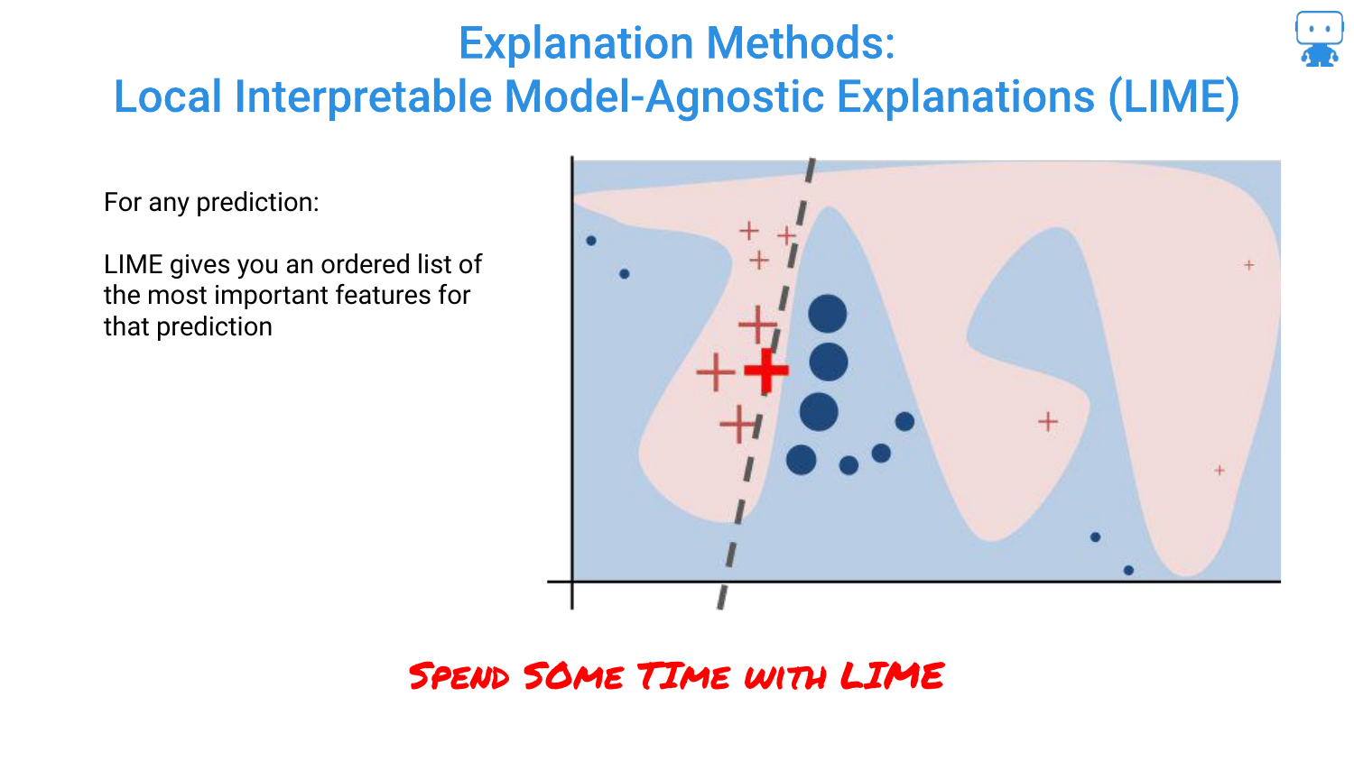
The speaker mentions LIME, one of the “traditional” or early techniques for this type of explanation. LIME works by fitting a simple local model around a single prediction to approximate the complex model’s behavior.
55. LIME Flaw: Explanations Should Be Identical
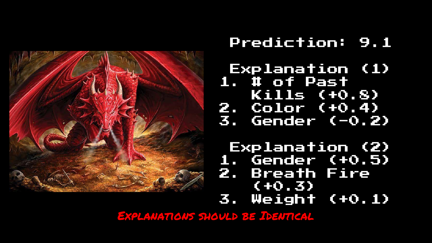
The tone shifts to a critique of LIME. The slide asserts a fundamental requirement: “EXPLANATIONS SHOULD BE IDENTICAL” for the same data and same model.
If you ask the model twice why it predicted a score for the same dragon, the answer should be the same both times.
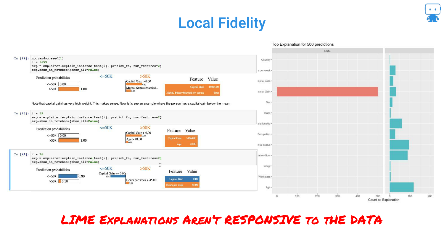
56. LIME: Two Different Explanations
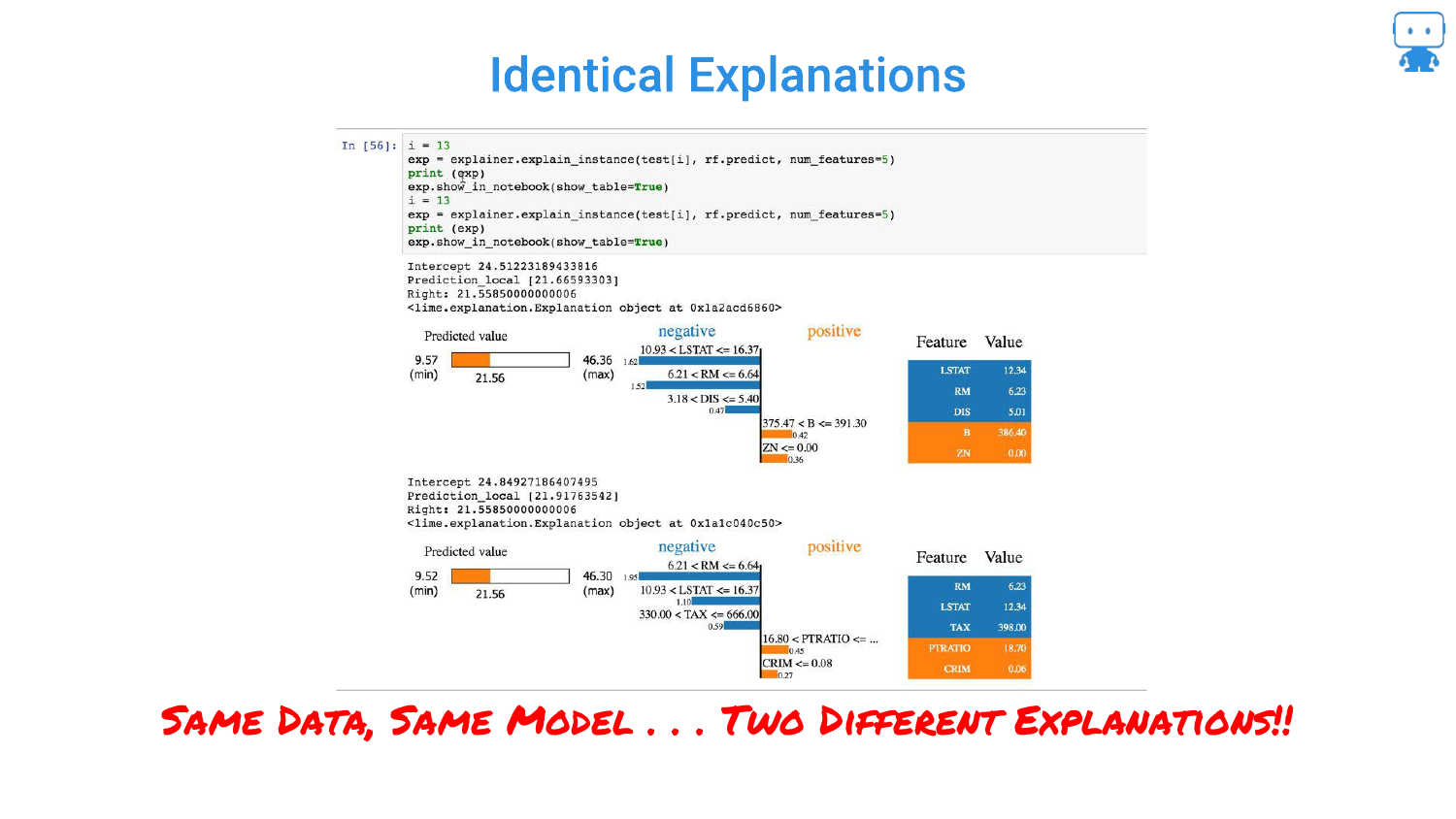
This slide provides code evidence of LIME’s instability. Running LIME twice on the “SAME DATA, SAME MODEL” produces “TWO DIFFERENT EXPLANATIONS.”
This occurs because LIME relies on random sampling to build its local approximation. This randomness makes it unreliable for serious applications where consistency is required for trust.
57. Explanations Should Have Fidelity
The speaker argues that explanations must have Fidelity to the data. If two data points are very similar, their explanations should be similar. LIME often fails this test, producing vastly different explanations for minor changes in input.
58. LIME Isn’t Responsive to Data
Further criticism of LIME. The slide suggests that LIME explanations sometimes lack “local fidelity,” meaning the explanation doesn’t accurately reflect the model’s behavior in that specific region of the data.
59. Anyone Relying on LIME is Toast

A blunt conclusion: “Anyone relying on LIME is toast.” The speaker strongly advises against using LIME due to these flaws, suggesting that while it was a pioneering method, it is no longer the standard for reliable interpretability.
60. What Can We Learn From This?

This slide summarizes the requirements for a good explanation method derived from LIME’s failures: consistency, accuracy, and fidelity. It sets the stage for introducing the superior method: Shapley values.
61. Your Model or a Surrogate Model?
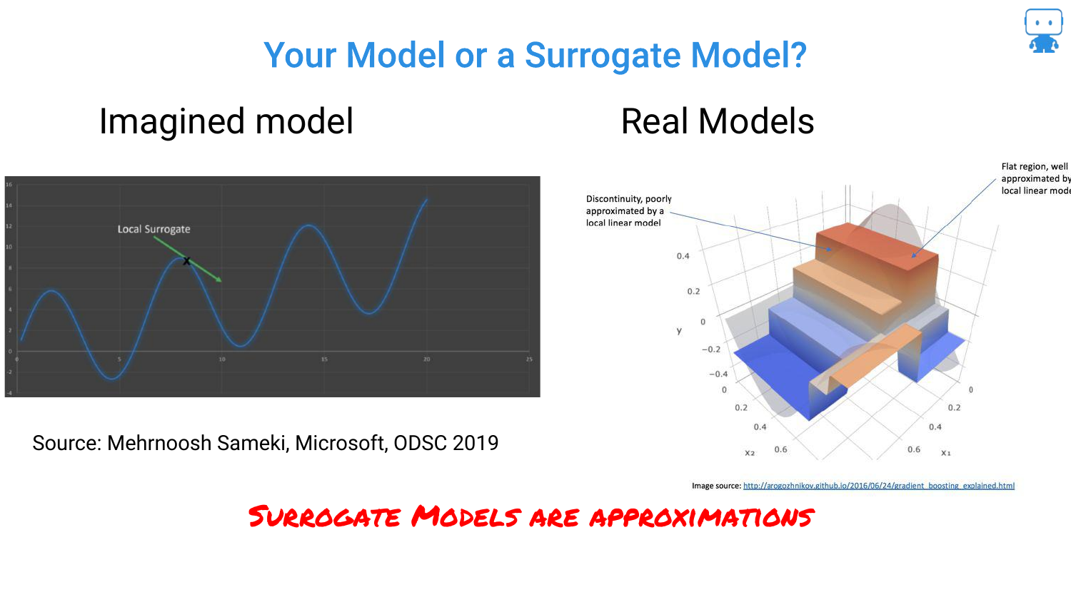
The speaker questions whether we are explaining the actual model or a surrogate (approximation). LIME explains a surrogate. Ideally, we want to explain the actual model directly.
62. What is Local?

Another critique of LIME involves the definition of “local.” The “kernel width” is a hyperparameter that changes the explanation. If the explanation depends on how you tune the explainer, rather than just the data, it is problematic.
63. Explanations Should Be Model Agnostic
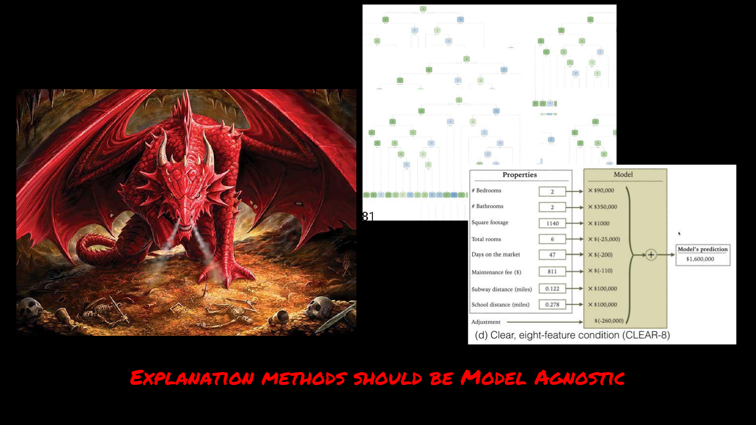
The speaker reiterates the requirement that the method must work for any model type (Trees, Neural Nets, SVMs). This is a strength of LIME, but also a requirement for its replacement.
64. Explanations Should Be Fast

Speed is critical. The slide compares LIME’s speed across datasets. If an explanation takes too long to generate, it cannot be used in real-time applications (like the hospital dashboard).
65. Shapley Values for Explanations
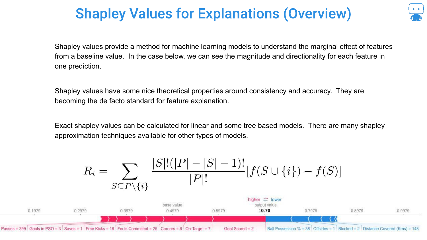
The speaker introduces Shapley Values as the modern standard. Originating from Game Theory (and Nobel Prize-winning economics), this method provides a mathematically sound way to attribute the “marginal effect” of features to a prediction.
66. Shapley Values Metaphor: Pushing a Car

To explain the concept, the speaker uses a metaphor: Pushing a car stuck in the snow. It’s a cooperative game. Several people (features) are pushing to achieve an outcome (moving the car/making a prediction).
The goal is to determine how much each person contributed. Did the teenager actually push, or just stand there?
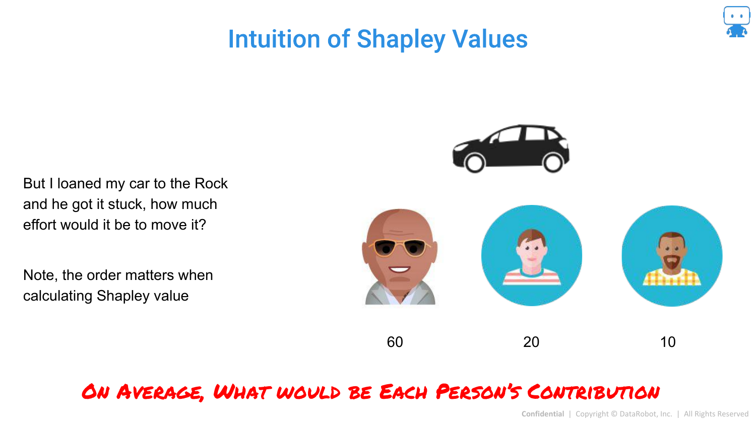
67. Intuition of Shapley Values
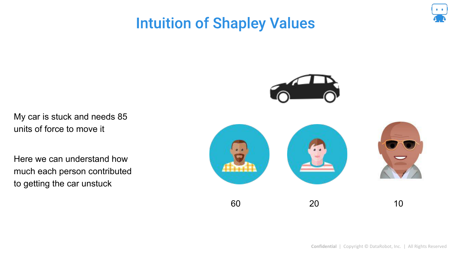
The speaker expands the metaphor. If “The Rock” joins the pushing, he might only need to add a small amount of force (10 units) to get the car moving because the others are already pushing.
However, if The Rock was pushing alone, he would contribute much more. Shapley values calculate the average contribution across all possible “coalitions” (combinations of people pushing).
68. Calculating Average Contribution
The slide visually represents different scenarios (orders of arrival). The contribution of a person depends on who is already there. Shapley values “unpack” this by averaging the marginal contribution of a feature across all possible permutations of features.
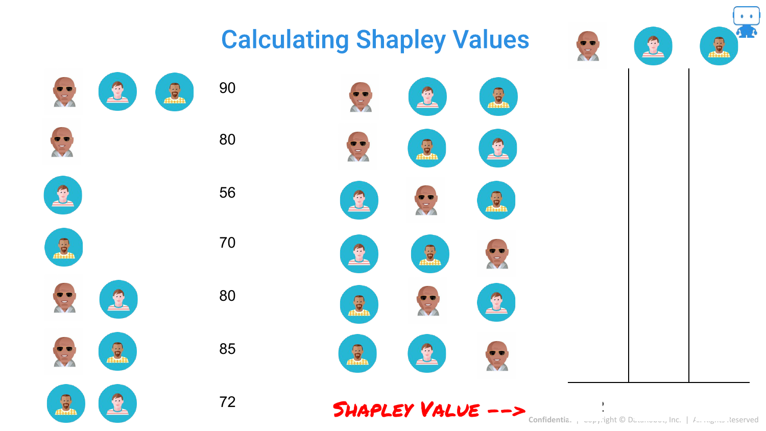
69. Calculating Shapley Values: Subsets
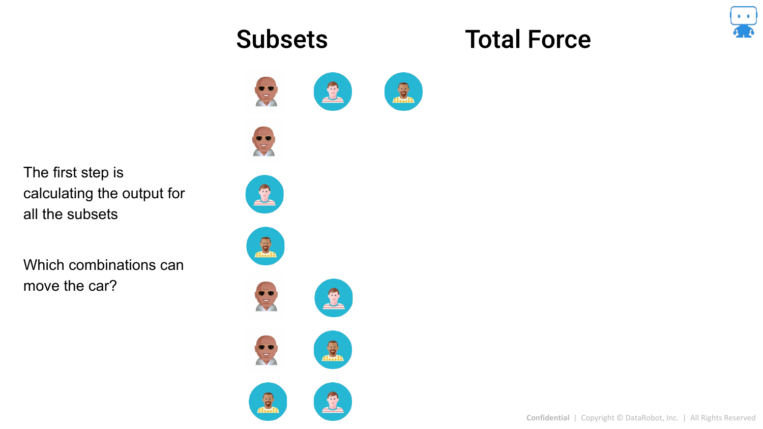
Mathematically, this means looking at all possible subsets of features. The slide lists the combinations (A alone, B alone, A+B, etc.) and the model output (“Force”) for each.
70. Calculating Shapley Values: Marginal Contributions
By comparing the output of a subset with a feature to the subset without it, we find the marginal contribution for that specific scenario.
71. Calculating Shapley Values: The Average
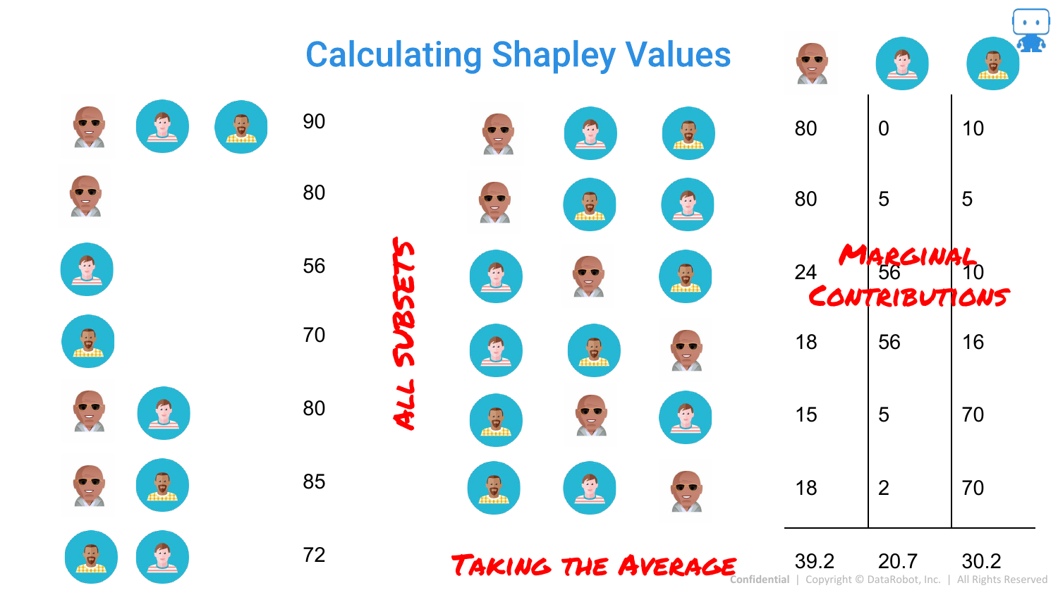
The final Shapley value is the average of these marginal contributions. This provides a fair distribution of credit among the features that sums up to the total prediction.
72. Shapley Values Formula
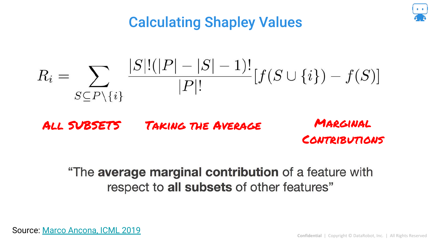
The slide presents the formal mathematical formula. It is defined as the “average marginal contribution of a feature with respect to all subsets of other features.” While complex, it guarantees unique properties like consistency that LIME lacks.
73. Shapley Values for Feature Attribution
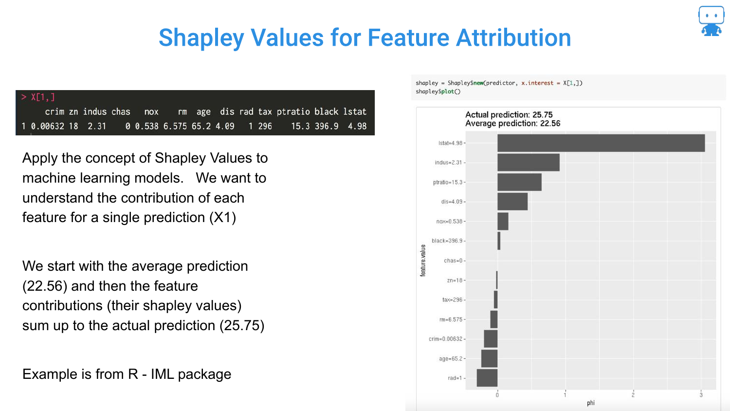
Applying this to Machine Learning: The “Game” is the prediction task. The “Players” are the features. The “Payout” is the prediction score.
The slide shows a Boston Housing prediction. The Shapley values tell us that for this specific house, the “LSTAT” feature pushed the price down, while “RM” (rooms) pushed it up, relative to the average house price.
74. So Many Methods for Shapley Values
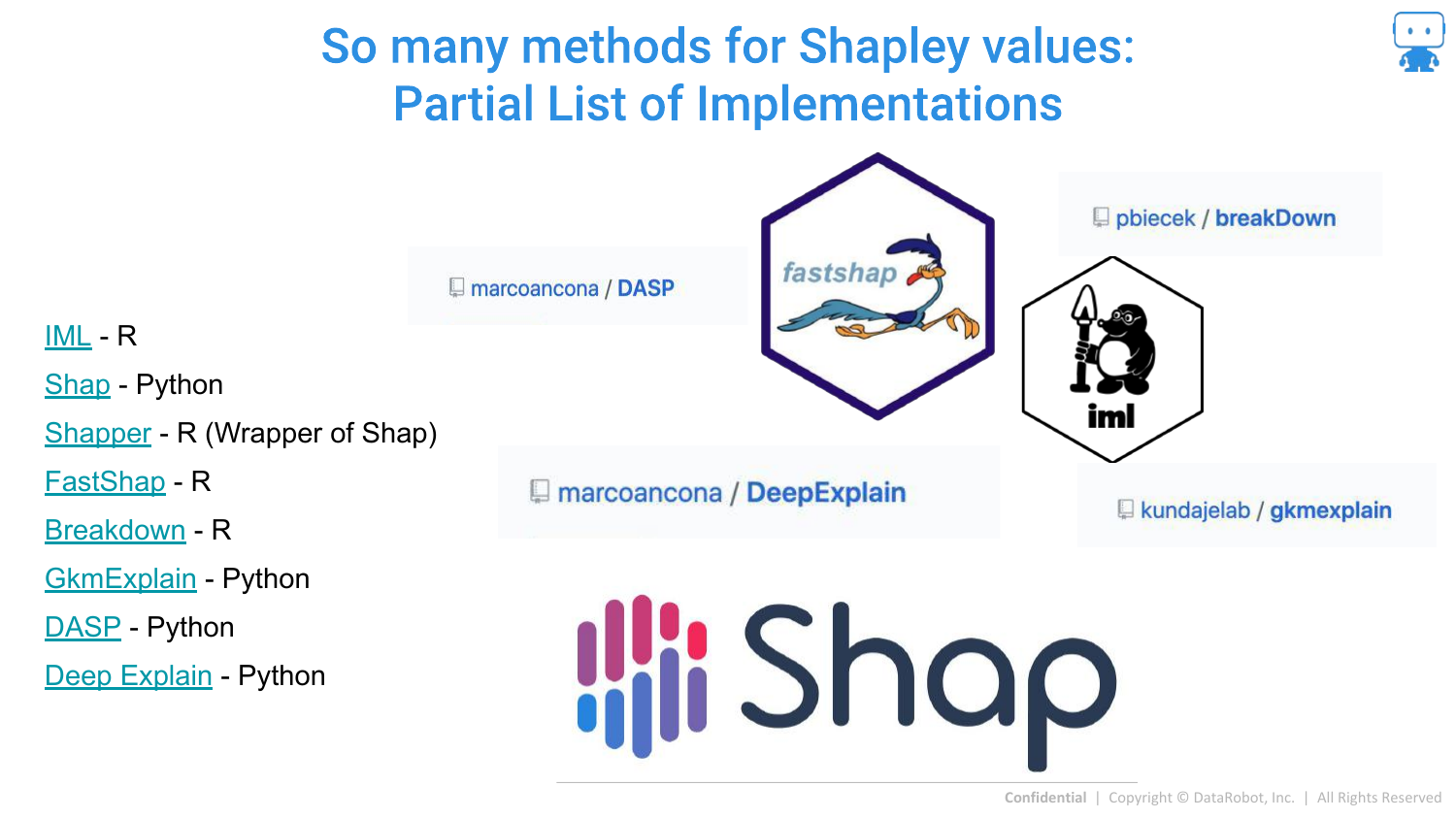
The speaker notes that calculating exact Shapley values is computationally expensive (2^N combinations). Therefore, many approximation methods exist. The slide lists implementations in R (iml, fastshap) and Python (shap).
75. Calculating Shapley Values - Linear Model
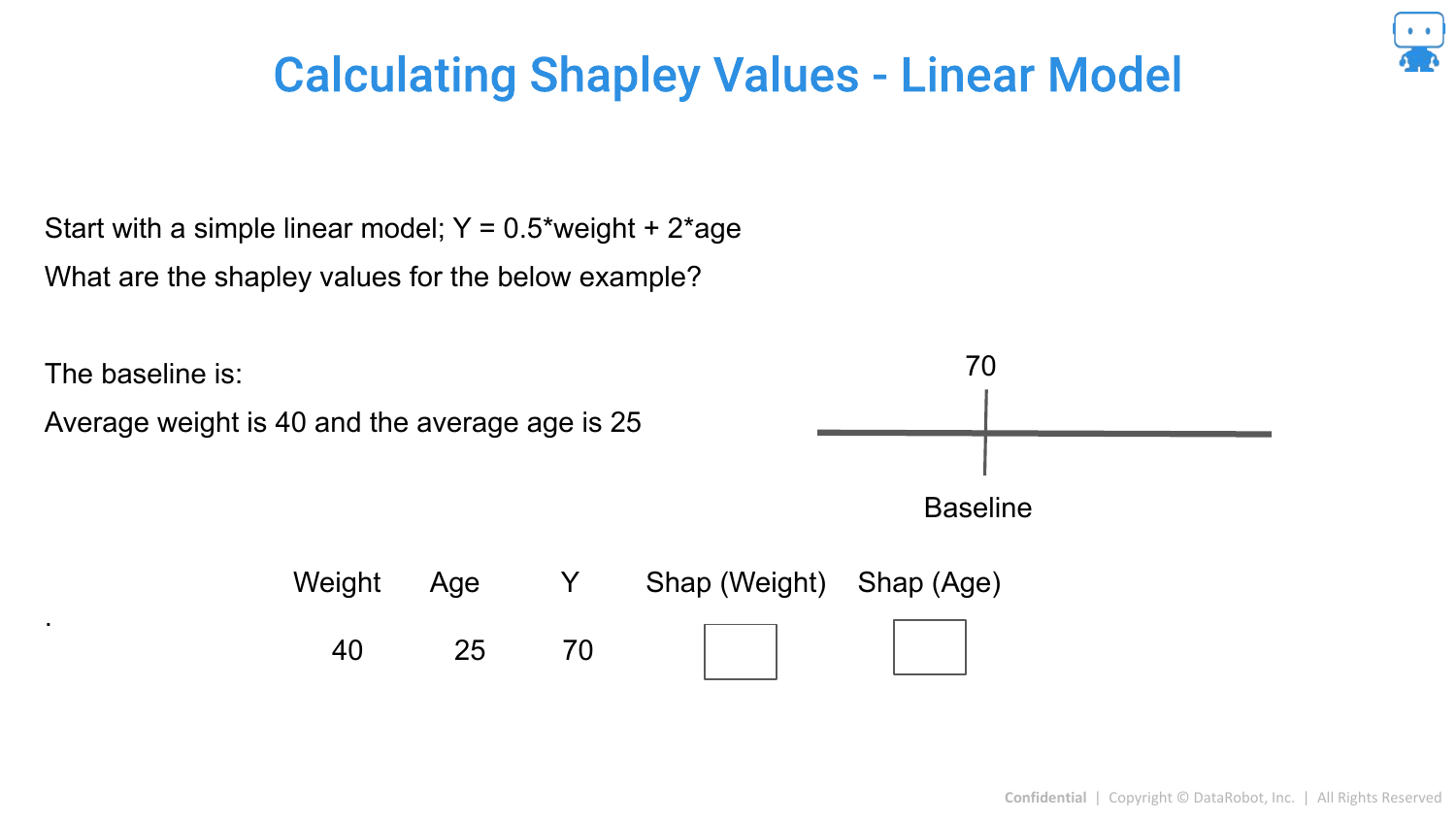
For a simple Linear Model, Shapley values are easy to calculate. Because features in a linear model are additive and independent (conceptually), the coefficient * value roughly equals the contribution.
76. Linear Model Example
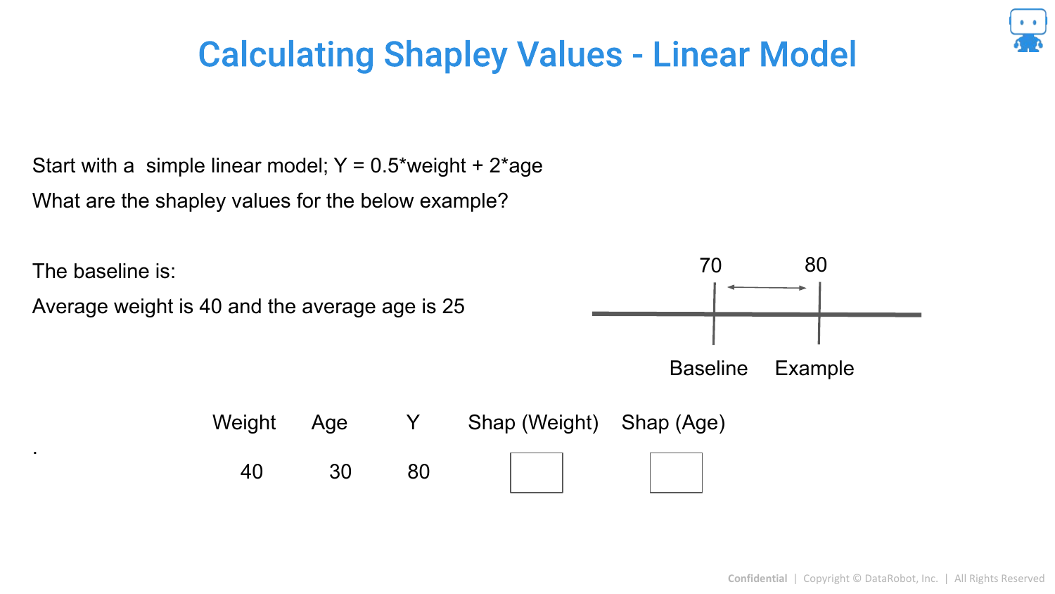
The slide shows that if you change the Age, the prediction changes by a specific amount. In linear models, the difference between the prediction and the baseline is simply the sum of these changes.
77. Simple to Get Shapley Values for Linear Model
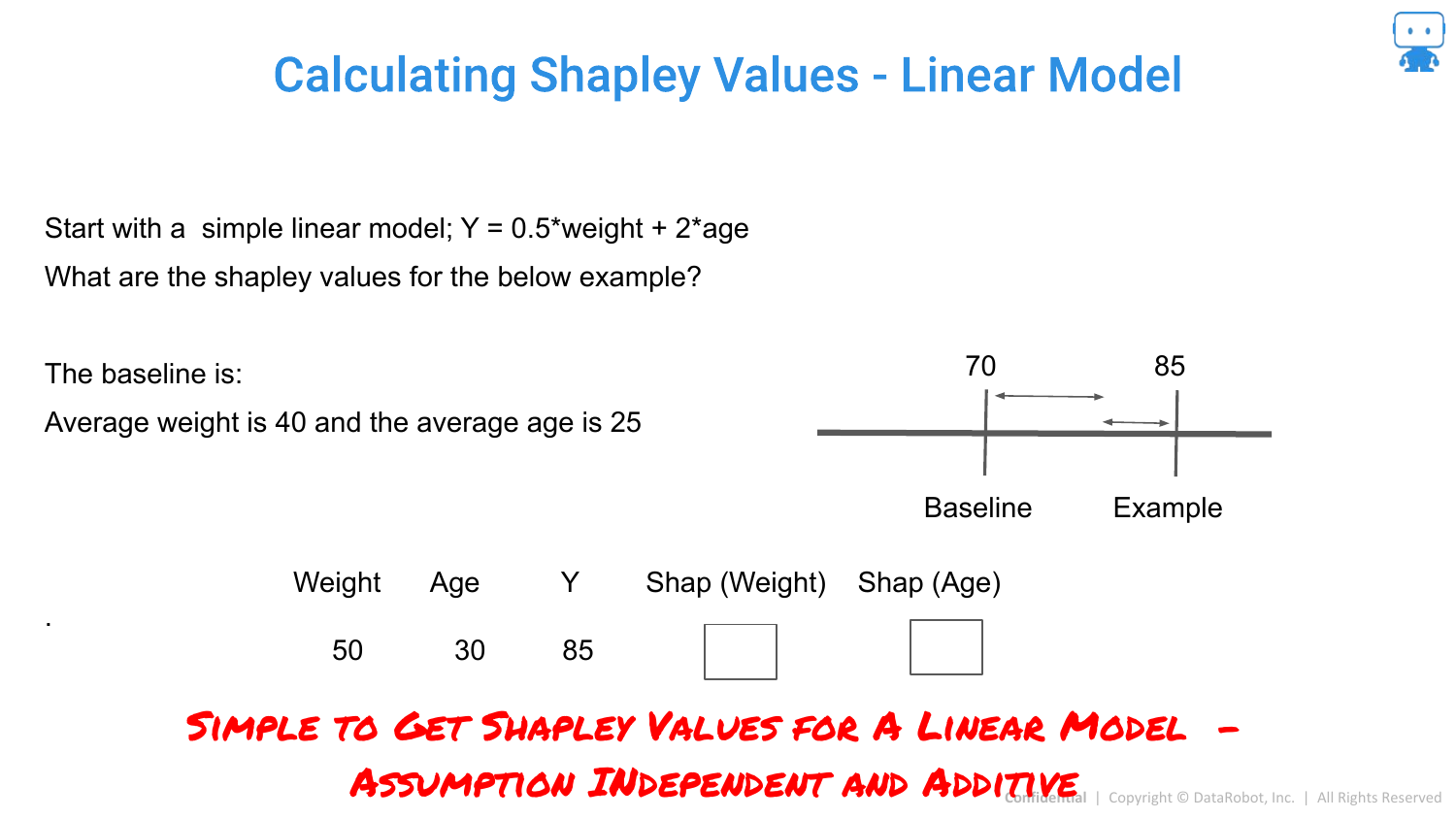
This reinforces that for linear models, we don’t need complex approximations. The structure of the model allows for exact calculation easily.
78. Shapley Values for Trees: Tree Shap
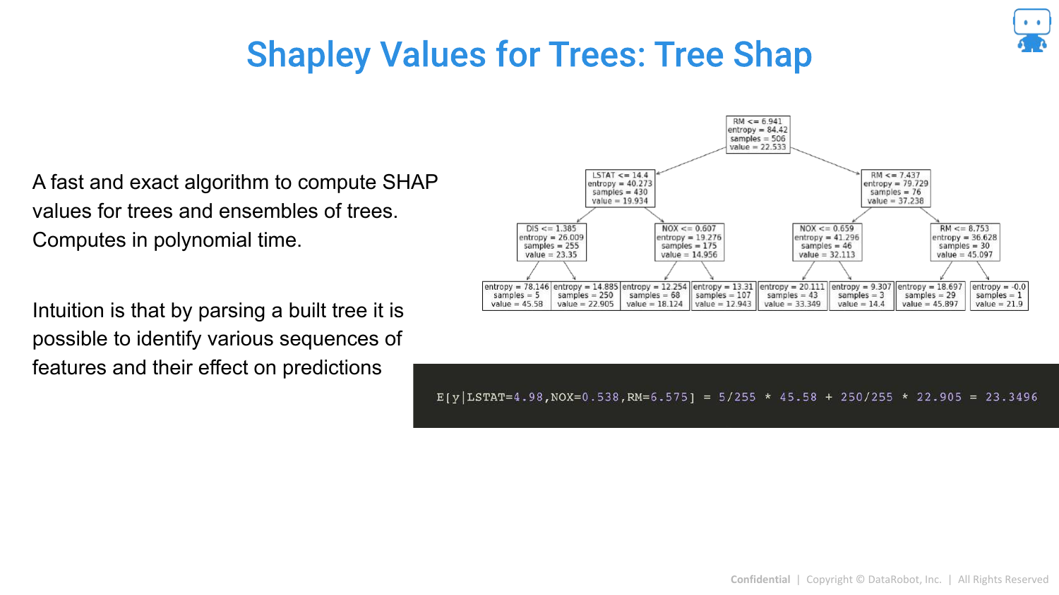
For tree-based models (Random Forest, XGBoost, LightGBM), there is a specific, fast algorithm called Tree SHAP (developed by Scott Lundberg). It computes exact Shapley values in polynomial time by leveraging the tree structure, making it feasible for large models.
79. Tree Shap Calculation
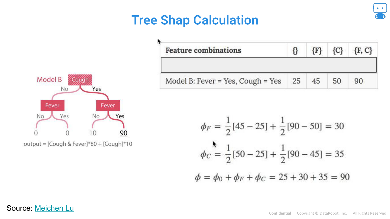
This slide visualizes how Tree SHAP works by tracing paths down the decision tree to calculate expectations. This efficiency is why SHAP has become the industry standard for boosting models.
80. Approximating Shapley Values
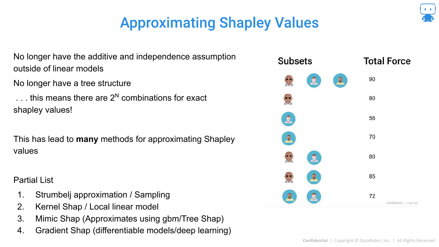
For other “Black Box” models (like Neural Networks or SVMs) where exact calculation is intractable due to the combinatorial explosion (100 features = impossible to compute all subsets), we must use approximations.
81. Approximating Shapley Values: Strumbelj
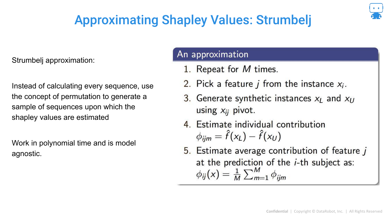
One method is Strumbelj’s algorithm, a sampling-based approach. It uses Monte Carlo sampling to estimate the difference between predictions with and without a feature, approximating the average marginal contribution.
82. Strumbelj Visualization
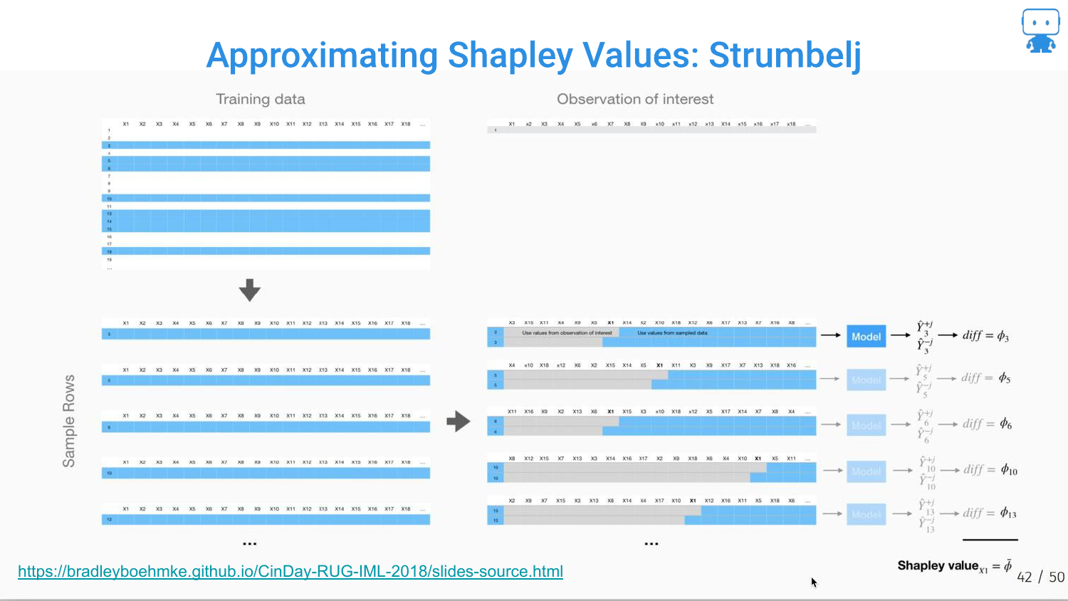
The slide visualizes the sampling process: creating synthetic instances by mixing the feature of interest with random values from the dataset to estimate its effect.
83. Approximating Shapley Values: Shap Kernel
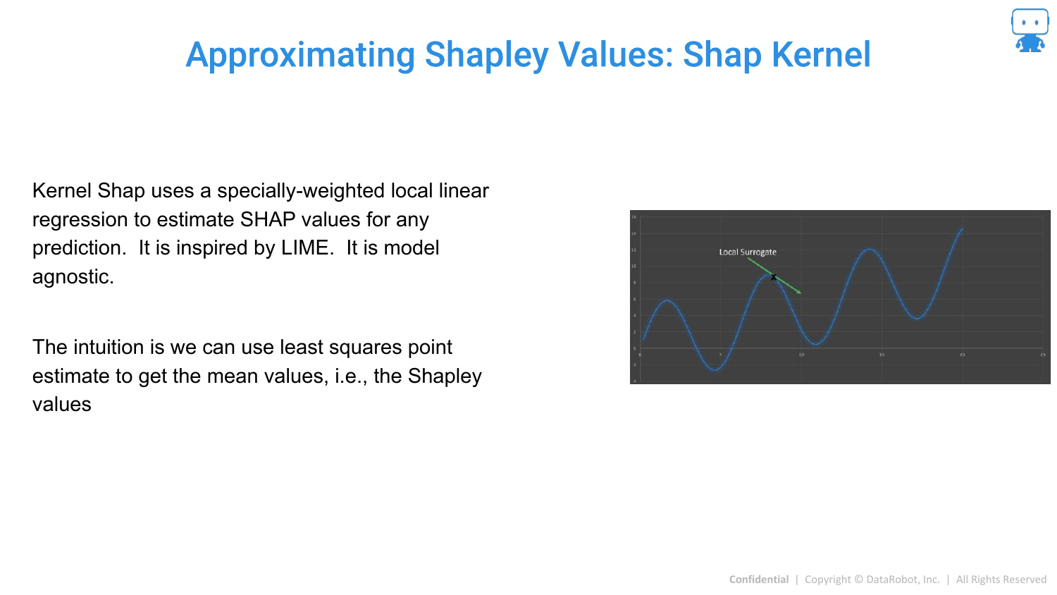
Kernel SHAP is introduced as a model-agnostic method. It connects LIME and Shapley values. It uses a weighted linear regression (like LIME) but uses specific “Shapley weights” to ensure the result is a valid Shapley value approximation.
84. Shap Kernel: Generating Data (1)
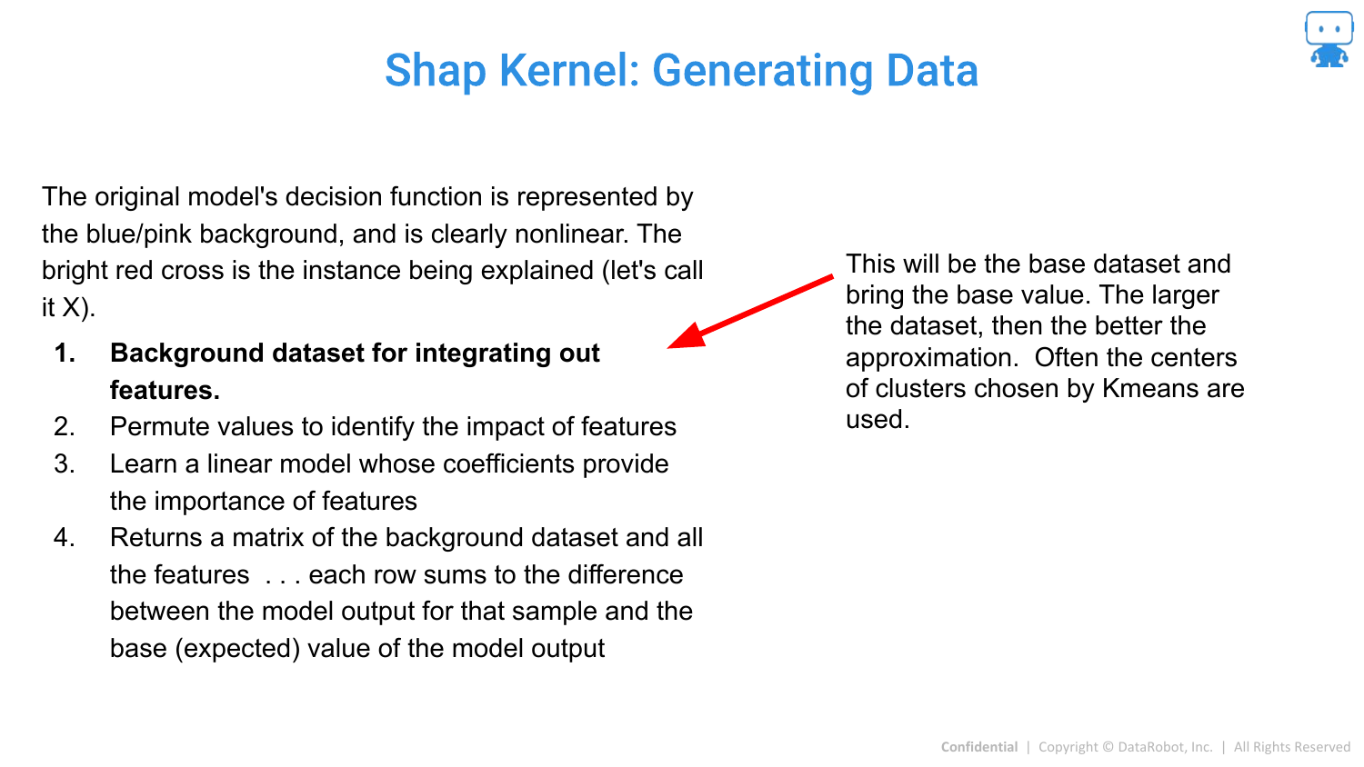
Note: The speaker skips detailed explanations of these calculation slides due to time constraints, but the slides detail the technical steps.
This slide shows the setup for Kernel SHAP, defining a “background dataset” to serve as the reference value for “missing” features.
85. Shap Kernel: Generating Data (2)
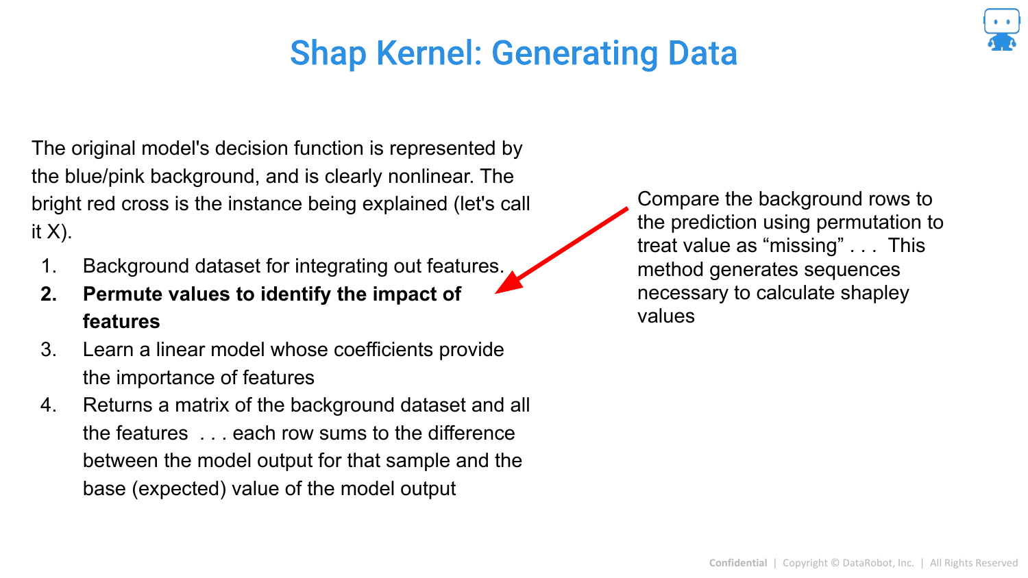
The method involves treating features as “missing” by replacing them with background values to simulate their absence from a coalition.
86. Shap Kernel: Generating Data (3)
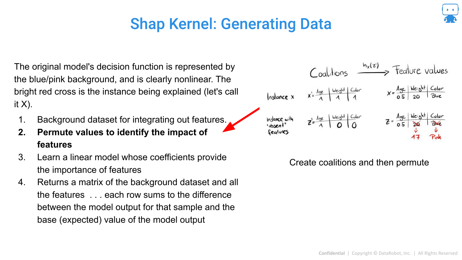
Permutations of feature coalitions are generated to create a synthetic dataset for the local regression.
87. Shap Kernel: Generating Data (4)
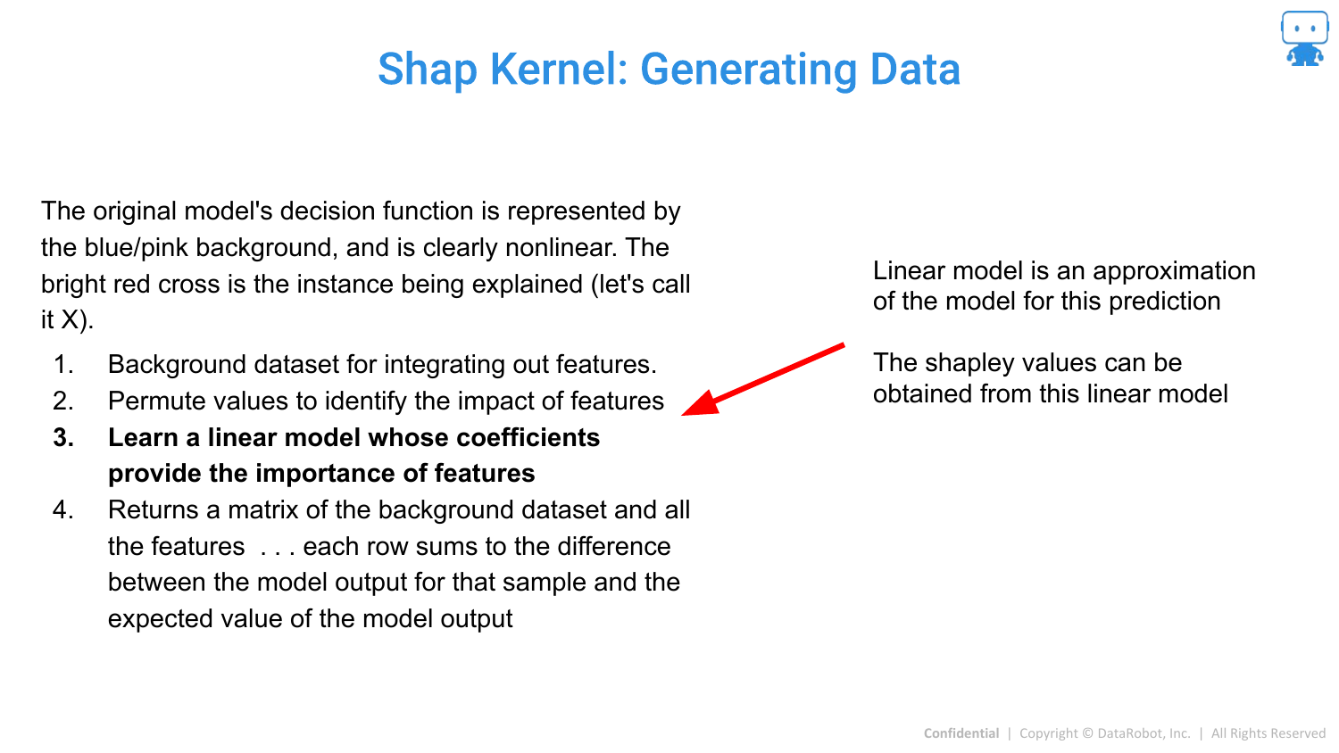
A linear model is fit to this synthetic data. The coefficients of this linear model, when weighted correctly, correspond to the Shapley values.
88. Shap Kernel: Generating Data (5)
The result is the attribution value for the specific prediction.
89. Mimic Shap

Mimic SHAP is another approximation where a global surrogate model (like a Gradient Boosted Tree) is trained to mimic the black box, and then Tree SHAP is used on the surrogate.
90. Gradient Shap
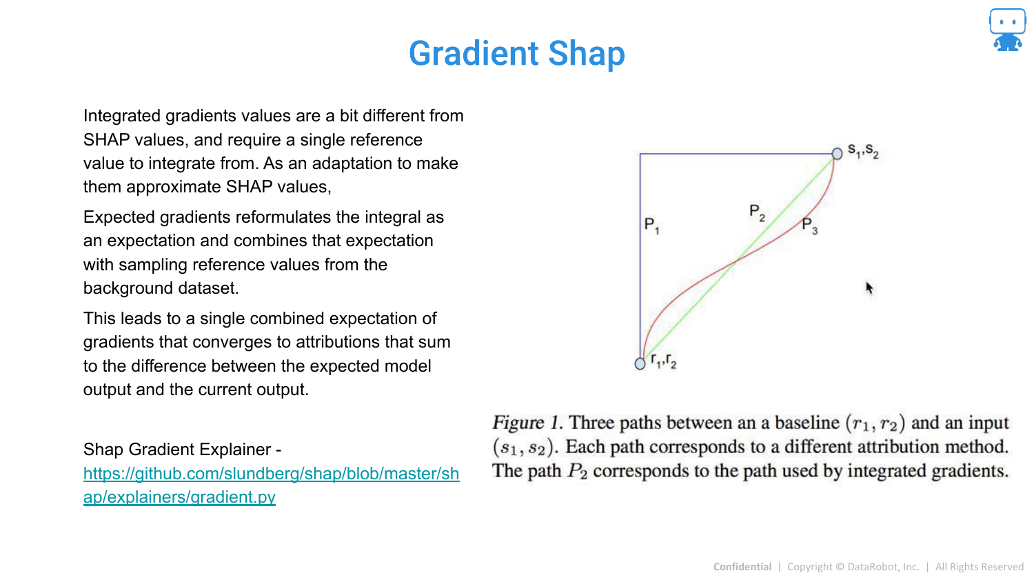
Gradient SHAP is designed for Deep Learning models (differentiable models). It combines Integrated Gradients with Shapley values for efficient computation in neural networks.
91. GkmExplain

A specialized method for non-linear Support Vector Machines (SVMs).
92. DASP
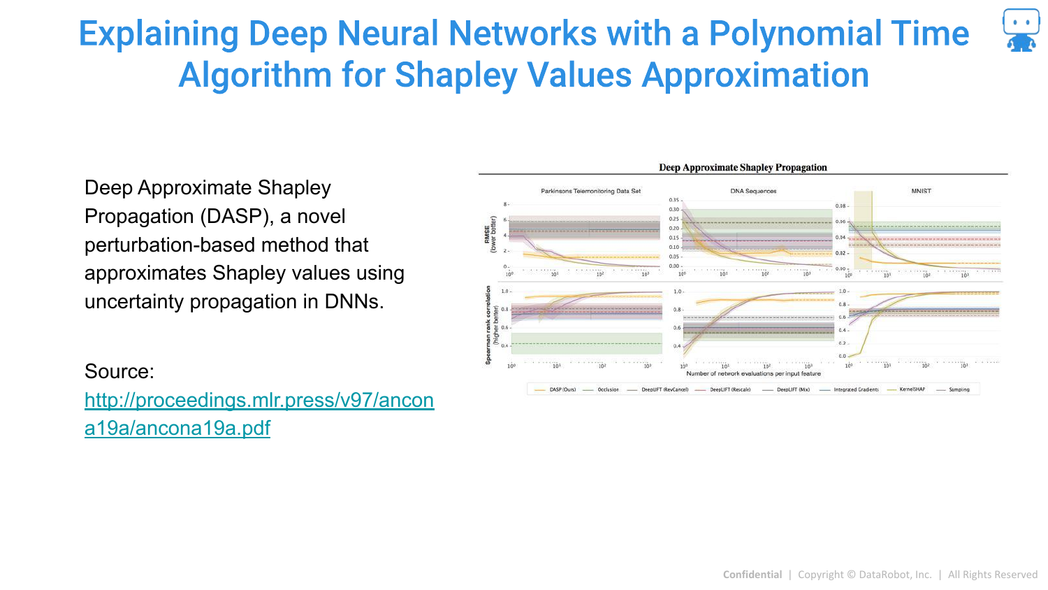
DASP is a polynomial-time algorithm for approximating Shapley values specifically in Deep Neural Networks.
93. Aggregating Shapley Values: Feature Importance
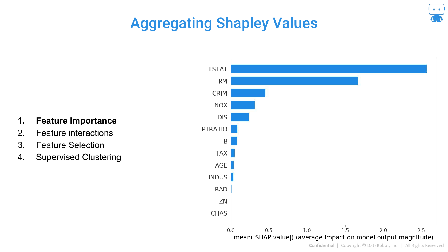
The speaker returns to practical applications. Once you have local SHAP values for every prediction, you can aggregate them.
By summing the absolute SHAP values across all data points, you get a global Feature Importance plot. This tells you which features are most important overall, derived directly from the local explanations.
94. Aggregating Shapley Values: Feature Interactions
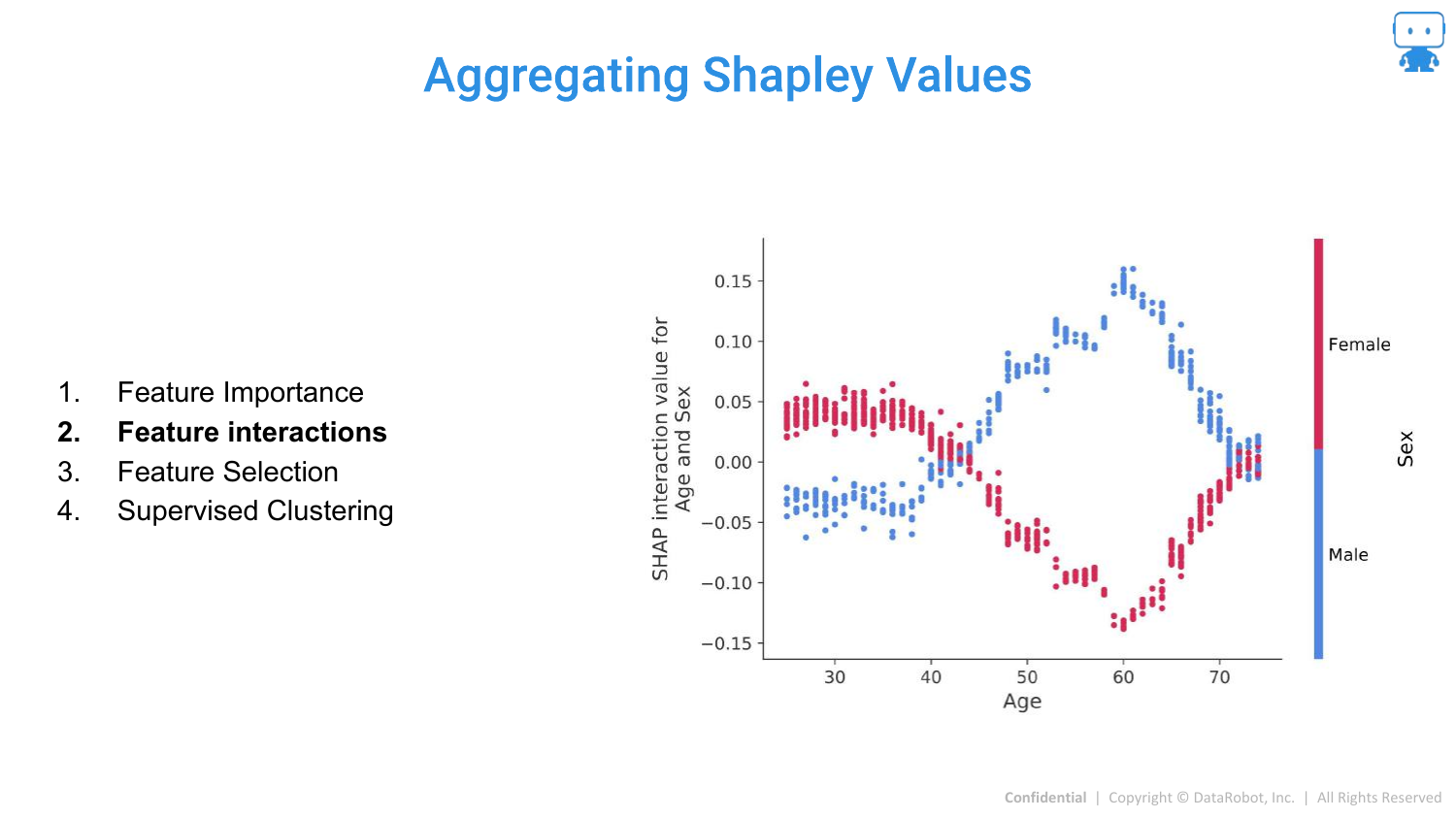
SHAP can also quantify Interactions. The slide shows the interaction between Age and Sex. It reveals that for males, a certain age range increases risk (prediction), whereas for females, it might be different.
This allows data scientists to see exactly how features modify each other’s effects, solving the problem of hidden interactions in complex models.
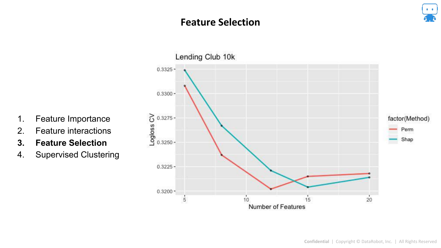
95. Aggregating Shapley Values: Feature Selection
SHAP values can be used for Feature Selection. By ranking features by their mean absolute SHAP value, you can identify the top contributors and remove noise variables, potentially simplifying the model without losing accuracy.
96. Aggregating Shapley Values: Supervised Clustering
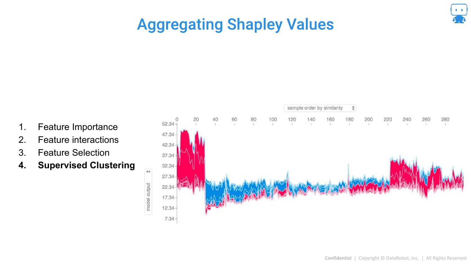
A “cool advanced technique” is Explanation Clustering (Supervised Clustering). Instead of clustering the raw data, you cluster the explanations (the SHAP values).
This groups data points not by their raw values, but by why the model made a prediction for them. This can reveal distinct subpopulations or “reasons” for high risk (e.g., a group of high-risk dragons due to age vs. a group due to weight).
97. Model Agnostic Explanation Tools Summary
The presentation wraps up by reviewing the three key tools covered: 1. Feature Importance (Permutation based) 2. Partial Dependence (for directionality) 3. Prediction Explanations (Shapley Values)
The speaker encourages the audience to use these tools to build trust and understanding in their machine learning workflows.
98. Question Time

The final slide opens the floor for questions and provides contact information. The speaker mentions that the slides and notebooks (including the age/milk and LIME examples) are available on his GitHub for those who want to explore the code.
This annotated presentation was generated from the talk using AI-assisted tools. Each slide includes timestamps and detailed explanations.